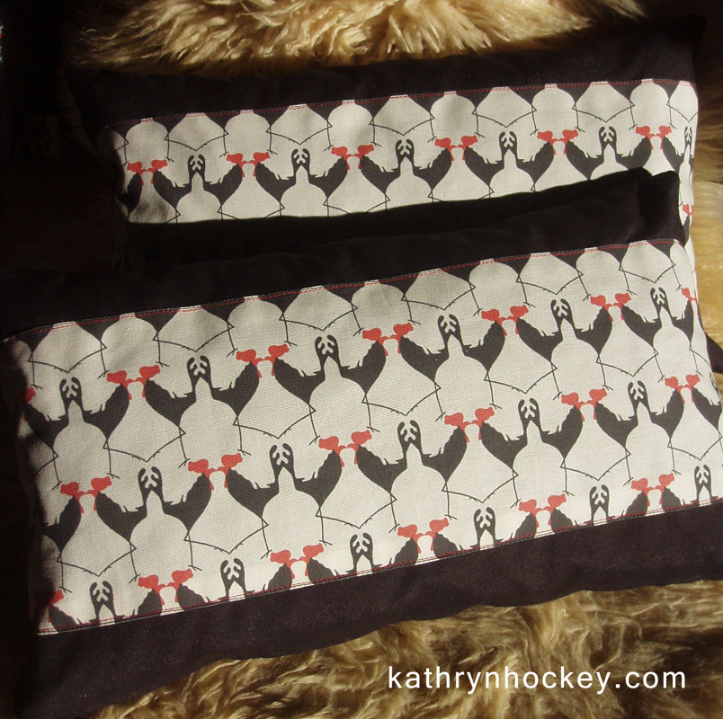
 These cushions are my latest cockerel fabric creations, made with love for Blanca and Alain, my dear friends and neighbours at La Casa del Arco in Vejer de la Frontera
Click here to see a photo of the cushions in their new home

 These cushions are my latest cockerel fabric creations, made with love for Blanca and Alain, my dear friends and neighbours at La Casa del Arco in Vejer de la Frontera
Click here to see a photo of the cushions in their new home
This fabric design evolved from a stencil project I started in 2012,
since when Mr Cockerel has adorned numerous hard and soft surfaces.
Last year I spent many happy hours in the Photoshop turning the original image (above) into several repeating patterns (below)
the last of which got made into a baby cushion in light cotton canvas.
I’ve been really keen to make myself an item of cockerel clothing ever since, so I ordered custom printed fabric samples in several cottons until I was totally happy with the size and colour of the design, and then got cracking with sewing an A-line skirt.
It’s had a very enthusiastic reception and I’m cock-a-hoop!
I was inspired to try and capture the humour and vibrancy of these beautiful and ubiquitous buses when I was in Guatemala in the autumn of 2014.
The buses are imported from the US or Canada once they retire from the school run and are then dolled up and converted, usually by a team of two people, who run them as public transport on specific routes, crammed to the gills with paying passengers, luggage and even livestock, hence the name Chicken Bus.
I used this photo which I took in San Pedro on the shore of Lake Atitlan as my model
I made this rather wonky sketch from the photo and scanned it into Photoshop
I copied the fat side of the wonky sketch, flipping it over to make a symmetrical template
and then set about making a careful pencil drawing
I scanned the finished drawing
and coloured it in Photoshop layers; at this stage the image looked a bit plain and flat
so I added more detail to the pencil drawing, scanned it into Photoshop
and applied the cut out line work over the coloured bus.
I had a lot of fun making 15 different coloured versions of the bus before I’d decided what to write in the destination boxes. In the end I added various invitations and questions (afterall, you can change your destination if you dance or dream) in Spanish before grouping them into three sets of five buses to make simple poems.
The background is scanned paper.
¿Listo? ¡Tranqui! ¿Paz? ¡Gracia! ¡Amor!
(Ready? Calm down! Peace? Grace! Love!)
¡Venga! ¡Guapa! ¡Sueña! ¡Vamos! ¡Vuela!
(Come on! Beautiful! Dream! Let´s go! Fly!)
¿Feliz? ¡Baila! ¿Cuando? ¿Donde? ¿Ahora?
(Happy? Dance! When? Where? Now?)
A friend I´d met on my travels asked where the bullet holes were since Guatemala has a somewhat deserved reputation as a trouble spot, so I added a few to the Peace? bus.
And I’ve just picked up the first paper versions from my printer…lovely colours, thank you Pepe.
Last summer Jackie Cornwall commissioned me to design the cover for her latest novel ‘The Three Witches‘. It’s the first in a series of six books that will make up ‘The Icarus Mendoza Sequence’, a thrilling adventure story spanning three decades of the life of the gifted and troubled Icarus Mendoza.
Jackie told me the outline of the entire sequence, emphazising the themes for each book and the colours she associated with them.
The backdrop to all the books would be the fictional town of San Amaro de la Frontera, which Jackie based on Vejer de la Frontera the beautiful Andalusian pueblo blanco (white village) where we live.
Almost immediately it struck me that the six book covers could feature a continuous townscape, representing constancy and refuge, and that the section of townscape depicted on the front cover of the first book could appear on the back cover of the second book and so on for the entire sequence to make an interlocking set.
A symbol representing the specific adventure theme for each book could then be superimposed over the townscape.
The first preparatory sketch for the six book covers; the vertical symbols looked a bit stiff
I sketched the symbols ‘looming’ to liven up the composition and give them a threatening feeling.
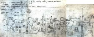 Working from photos I’d taken of Vejer I sketched a montage of views.
I decided to experiment by drawing the townscape in charcoal so that I had a ‘negative’ image
that I could scan into Photoshop, splicing all the sections together and inverting it to make it white. I also removed the background
This turned out to be very labour intensive, I had to draw, scan, invert and splice two extra sections of town before I had an image long enough to cover the estimated length of all six covers.
I wanted to create richly coloured backgrounds with interesting textures so I opted for watercolour paint, using the wet on wet technique on heavy weight paper with a rough grain, referring to the notes I’d made on Jackie’s colour preferences for each book.
The ultramarine watercolour background for ‘The Three Witches’ cover
At this point Jackie clarified which symbols she thought were apt for each book and offered suggestions to replace those which weren’t.
I drew each symbol in pencil and scanned it into Photoshop.
Then I cut out the line work and coloured it to match the background
Finally I added the text.
Here are the finished covers:
And here’s the interlocking set of six again, you can click on it to make it larger.
The Three Witches is a ripping yarn; my favourite quote is
“Dance, like romance, is one of those sweet, cruel mechanisms by which little girls are enticed into a life of slavery.”
It’s available to purchase now on Amazon.
This little cockerel cushion is the latest addition to my ‘textile range‘, made from a fabric sample printed with one of my cockerel designs.
I made the baby cushion as a gift for the recent arrival who lives in the house where I sketched the original cockerel, which turned into a stencil
which has since adorned many walls….
and even a few items of clothing……
I was a bit sad to find out recently that despite his regal appearance the cockerel I drew was firing blanks and was put up for adoption, but he died of shock just before his new owner turned up to claim him….just shows, a cocky exterior hides a multitude of insecurities….
A few months ago I had some fabric samples printed with a few of my designs. I was recently inspired to make these into bunting and cushions to show alongside the digital prints on paper of the same designs which I’m currently exhibiting in the beautiful tea room Chokolata in Vejer de la Frontera.
Here is a cockerel (which started out as a stencil on wood) being sewn with a contrasting border prior to his edges being frayed.
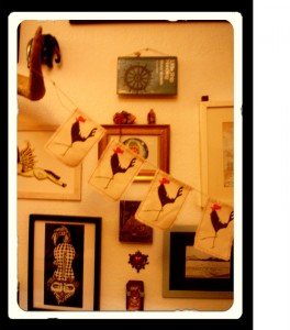
Here is the finished bunting hanging at home. To see photos of the bunting at the exhibition click here
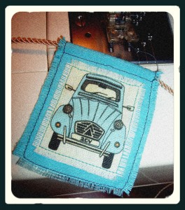
I also made bunting from the fabric sample printed with my 2CV design (which evolved from my ‘7 Days’ illustration project).
Click here to see the bunting at my exhibition.
Here are the cushions.
I backed my printed fabric samples with contrasting velvet, cotton and corduroy to make them go further.
The Dragonfly pattern also evolved from my ‘7 Days’ illustration project.
To see photos of the cushions at my art exhibition in Chokolata click here
‘7 Days‘ is the title of the fifth and final assignment I completed for my illustration course with the OCA (Open College of the Arts)
The series of 7 patterns (1 for each day of the title) was inspired by a summer boating holiday on the Canal du Midi in the south of France, and also by the wonderful woodblock designs for wallpaper and fabric of Marthe Armitage, the dramatic wallpapers featured in Sherlock the TV series and the films August:Osage County and American Hustle.
The title page shows the location:
I chose 7 themes from the trip and made a motif for each, which I then multiplied to make a pattern:
Day of the 2CV
Day of the Sunflower
Day of the Plane Tree
Day of Patisserie
Day of the Dragonfly
Day of the Grapevine
My ultimate aim is to reproduce some if not all of these patterns on wallpaper, fabric and other surfaces.
The method was pretty much the same for each pattern; here’s an outline:
For those who are interested in seeing the production method for each image in more detail I’ve added them below:
Title page
For the background I made a map of Europe by tracing the outline in pencil onto squared paper
which I then scanned to Photoshop and inverted
I then collaged the map in Photoshop layers with some bought paper
and marbling I had made using oil paints
and a French flag which I found through an internet search
I distorted the map with the free transform tool and applied my inverted outline of a plane tree and grapevine pattern (methods below), adjusting the layer blending modes, tone, saturation, curves and levels in Photoshop.
I printed the text ‘7 Days a journey in patterns’ from Photoshop , traced it in pencil and scanned the tracing back into Photoshop where I coloured / inverted it
I wanted to show the location of the Canal du Midi, so next I made a collage of another map of France I found through an internet search, applying torn fragments from a French road atlas
working over it in water soluble green crayon and a wash of acrylic paint
before applying a crackle glaze and white acrylic paint to highlight the cracks and scanning it into Photoshop
I traced the outline of the canal in Corel Painter layers from this map I found on the internet and applied it to my cropped collaged map in Photoshop, adjusting the tone and saturation, adding text to mark Toulouse and Sete (the towns at either end of the canal), and creating a border using the brush tool and a scan of aged paper in layers.
I had a practice run at labeling France on a print out my map of Europe (to which I’d applied a crackle glaze and white acrylic paint) with collage and biro
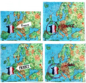 I cut out the collaged label of the lower left version in Photoshop and applied it over my background, including a smaller duplication of the ‘flagged’ France and a smaller duplication with reduced opacity of the Canal du Midi map over the larger ‘flagged’ France map
Finally, in Photoshop, I adjusted the tone and saturation of the background to improve the contrast, added and coloured a boat from the locks pattern (see below) labelled the Canal du Midi on the larger map insert and added an inverted outline of the 2CV drawing (see below).
Patterns:
2CV
Research photo taken in France, I also referred to a photo I found on the internet
Pen drawing
Scanned to Photoshop, line work cleaned and cut out
Coloured in Photoshop
Curves adjusted, image duplicated and scanned paper added in Photoshop layers for background texture
Tone adjusted to achieve different coloured versions
Locks
3 sketches made on site to show how the canal boats go ‘up and down hill’ via the lock system
1 of many, many photos I took of the boat in a lock
A series of sketches I made to work out how to show how boats move up and down stream through the lock mechanism in ‘3D’
I traced the final sketch, made a pen drawing and scanned it to Photoshop in 2 parts
The line work is cleaned, duplicated, aligned and cut out in Photoshop
Outline duplicated in Photoshop layers on a scanned paper background with stripes added with the brush tool
Collage and colour applied to the line work in Photoshop layers: leaves with the collaged map of France (see above); water with the brush tool; locks with the photo of concrete shown below
Finally the single unit is duplicated and stripes of scanned blue paper are added in Photoshop layers. I also added a final outline layer over the top to improve definition. The repeated unit is reminiscent of the form of Tibetan thangka art
Sunflowers
Research photos taken on the spot
Rough sketches for possible pattern layouts, I wanted to show the sunflowers rotating, as if towards the sun
Pencil drawings
Drawings scanned to Photoshop, line work cleaned, trimmed and cut out
Pattern trials made by duplicating layers in Photoshop
Sunflowers coloured in Photoshop layers: yellow centres and green parts collaged with different tonal versions of the France collage map (see above); petals with flat and graduated digital colour
Collaged sunflowers duplicated to form single unit of repeat
Single unit duplicated and flipped vertically
Colour and pattern trials
I finally settled on a blue background, to represent the summer sky, adding texture to it via a scanned canvas
Plane Tree
Planted between 1681-1810, plane trees line long lengths of the Canal du Midi and are dying because of a fungus but I decided not to portray the dying trees in favour of ‘aesthetic delectation’.
Sketch made on site
1 of many research photos taken on site, I also referred to this Natural History Museum photo
Rough sketches to work out a single repeating unit
Pen drawing of the single unit
Single unit duplicated in Photoshop layers
Pattern line work inverted
Yellow tonal version of my collaged map of France added as a background to the inverted cut out line work. It overpowered the pattern which lacks definition
I redrew the single unit in pencil, adding more detail
Drawing scanned to Photoshop, line work cleaned and cut out
Collaged in Photoshop layers with my France collage map
Line work inverted and tone of collage adjusted, I love these autumnal shades but my pattern needed to be summery green
Layer effects applied to inverted line work
The version I decided to repeat
Pattern variations
Patisserie
Research photos
Pen drawings made from photos
Drawings scanned to Photoshop, line work cut out, inverted, duplicated and coloured in Photoshop and Corel Painter12
Coloured cakes duplicated to make a pattern
Inverted line work introduced to background to add depth, subtle granular texture added
Closer crop
Dragonfly
Research photo
Partial pen drawing
Drawing scanned to Photoshop, cleaned, part duplicated and flipped horizontally
Playing with tone and saturation settings
Line work inverted
Playing with tone and saturation settings for the inverted version
Inverted line work multiplied
Line work on a scanned paper background
Multiplied
A4 crop
Grapevine
Research photos
Preliminary sketches from photos
Pen drawing
Scanned and duplicated
The single unit was collaged in Photoshop layers with the following material:
marbling I made with oil paints
scanned to Photoshop and tone/saturation adjusted for the grapes
my collaged France map for the vine leaves
textured paper for the ground
textured paper for the vine trunks
The duplicated collage
A closer crop