These collages are made with found wood, bottle caps, ribbon, string, feathers and paper scraps
The ‘Pray for Surf’ image is available as a postcard

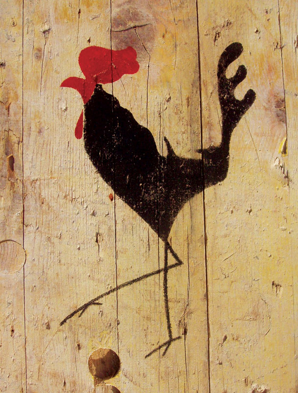
This piece evolved from a little pencil sketch I made of a neighbour’s cockerel during an exercise for a distance learning illustration course.
I scaled up the sketch and used it to cut a stencil through which I applied acrylic paint to reclaimed wood. It still serves as a house sign for the home of the cockerel and his human companions.
This image is now available on postcards and as digital prints (A3 and A4) and I can stencil him onto almost any surface.
I gradually darkened this drawing with layers of charcoal, accentuating the planes and regions of the face. I developed it to make a stencil type portrait which I manipulated digitally and used as a template for a screen print (see below).
I was out at a concert in a bar in the village one night when I noticed a local photographer checking his camera at the bar; he’d taken some really striking portraits of the band and audience in black and white and I was particularly struck by the dark intensity of one of the shots and knew that I must make a drawn version. The photographer very kindly gave his permission, so I set to work with a charcoal version.
Having fixed the first charcoal layer I added to it to make the background and facial shadows more intense.
I then decided to ‘age’ it and to give it more warmth by adding an acrylic wash in a sepia tone and a layer of crackle glaze before applying stains to highlight the cracks.
It took several weeks before I ran into the subject of the portrait and was able to gain his permission to publish the piece, which I cropped close to emphasize the intimate pose.
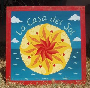
I was commissioned to design a sign for a house called La Casa del Sol, which could also be used as an image for business cards by a lovely lady who is a ’Lightworker’. She wanted a representation of the sun, sky and sea in the form of a mandala, painted in bright, positive colours.
Having researched the client’s ideas I made small preliminary sketches, developing the one which stood out as being particularly harmonious into a larger line drawing, which she approved. She also decided on the size and shape of the sign at this point and approved the colour samples I’d made.
I painted the sign on primed marine plywood in gloss paint, using several coats of varnish to make it weather proof and used a simplified version of the sign for the business cards. The client was delighted with the results.