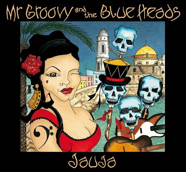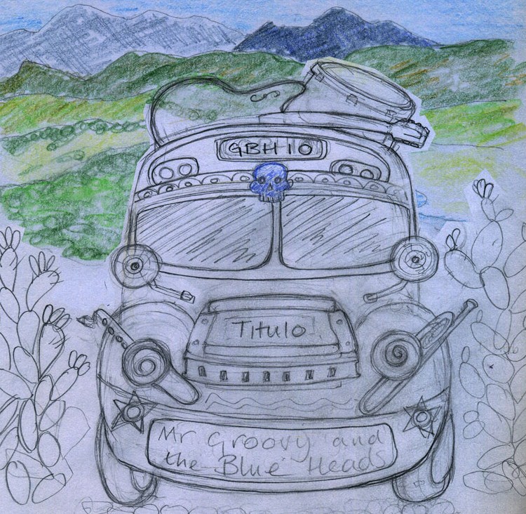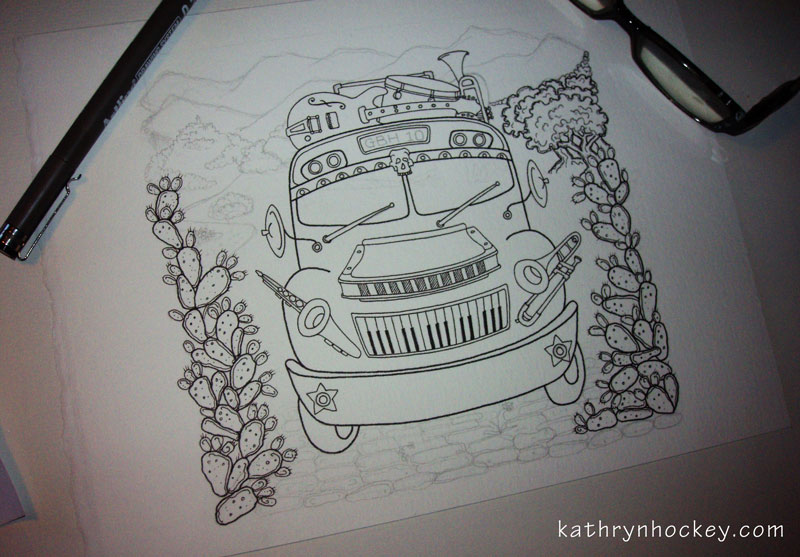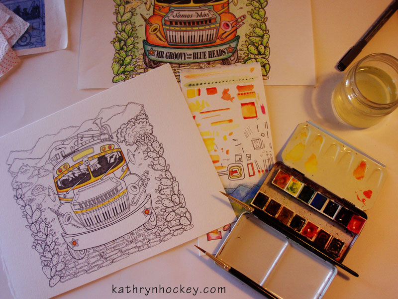
![]()
I recently designed the logo above for Alquimia (Alchemy in Spanish) , a magical full moon fine-dining and entertainment experience set against the beautiful natural backdrop of La Costa de la Luz in Andalusia.
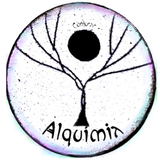
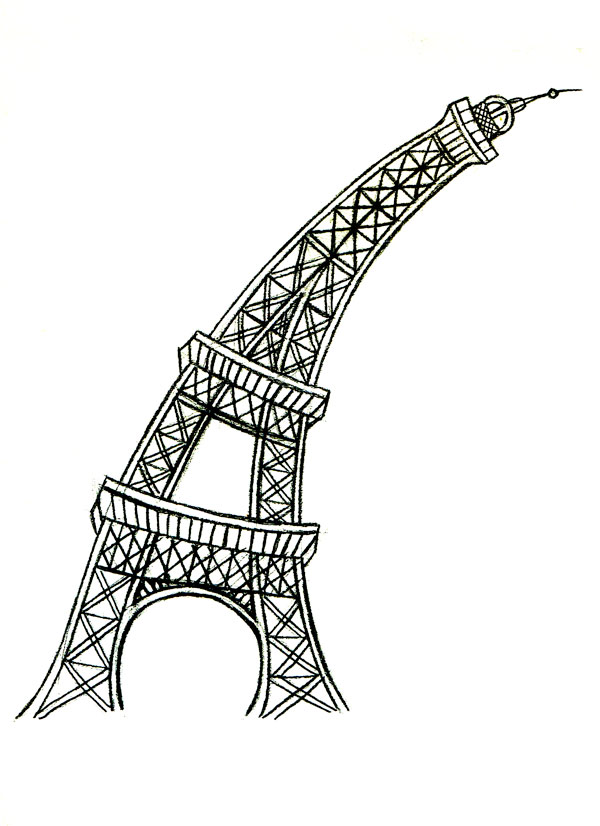
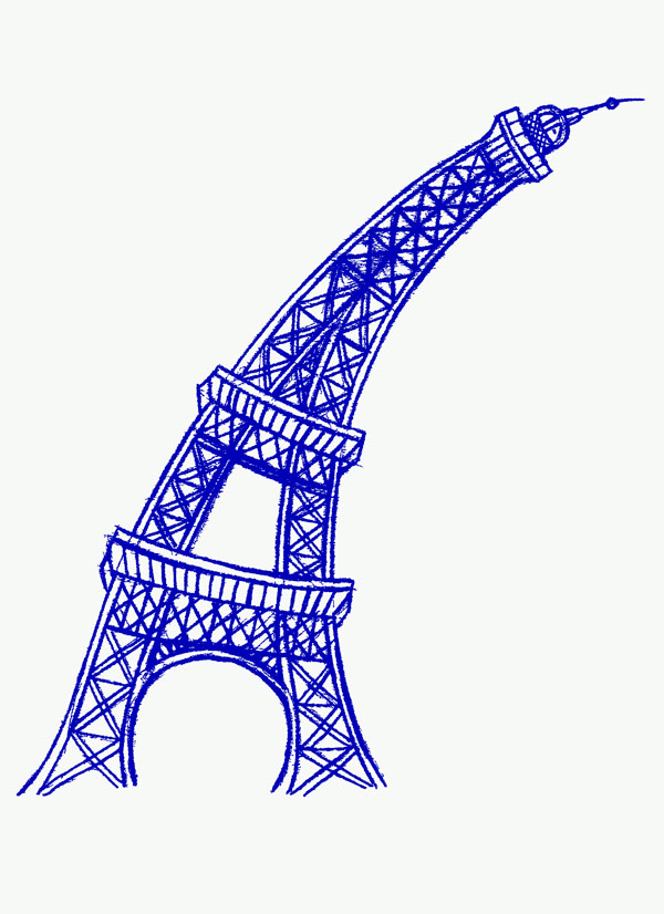
The brief was to incorporate a tree and full moon theme with art nouveau style text as shown in the sketch I was given to work from (left) .
I duplicated the tree image and inverted the colours so that the moon and tree appear to shine in the night sky.
I can see all sorts of additional imagery in the finished design which reflects the mysterious nature of the event; bat, owl and dragonfly wings, the face of a fox, the figure of a woman, a chalice, a heart….
…I can;t wait for my first taste of the Alquimia experience tomorrow night, the menu alone promises many delights:
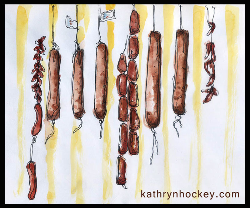
1. Roasted autumnal vegetable soup with a baked wafer, jamón lardons and angel hair garnish
2. Baby Green Leaf salad with sprouting herbs, edible flowers and white balsamic pearls
3. Fresh fish from the port with samphire, new potatoes, a lemon and chilli sauce and spiced smoked mackerel pate
4. Local Blue sheep’s cheese and alejandrina pear salad with organic walnuts and honey
5. Griddled fillet of local Retinto beef wrapped in jamón ibérico with a red wine jus served with milk soaked courgette fries
6. Wild mushroom, truffle and pine salted croquettes with an aged parmesan dressing
7. Bitter Chocolate tart served with orange wine from la Barca caramelized pistachios and crème fraiche
8. Selection of artisan cheeses with homemade chutney and baked crackers
9. Baby Guinness expresso shot