Dragonfly Dress Mark 2

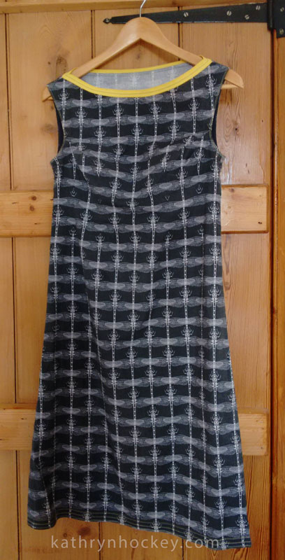
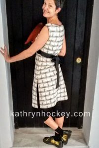
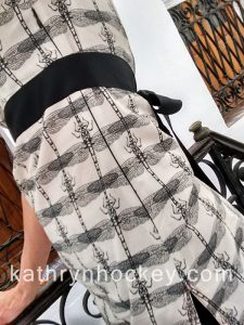
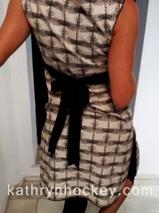
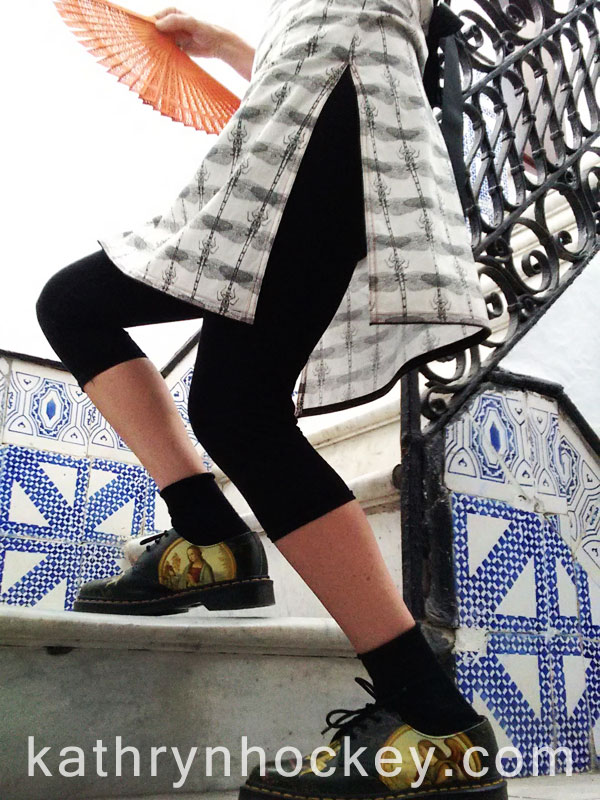
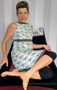
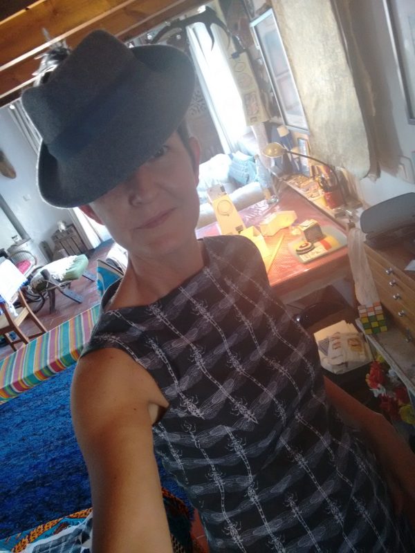
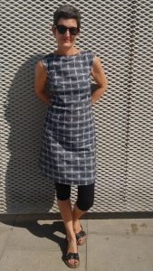
To accommodate my physical expansion since last year I recently made myself another summer dress from my grey dragonfly fabric.

dragonfly, fabric, surface design, illustration, textile design, woven monkey, dress making, dress, sewing, homemade, home sewing, made to measure

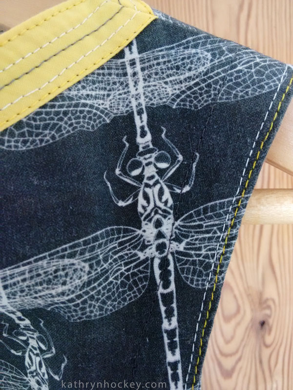
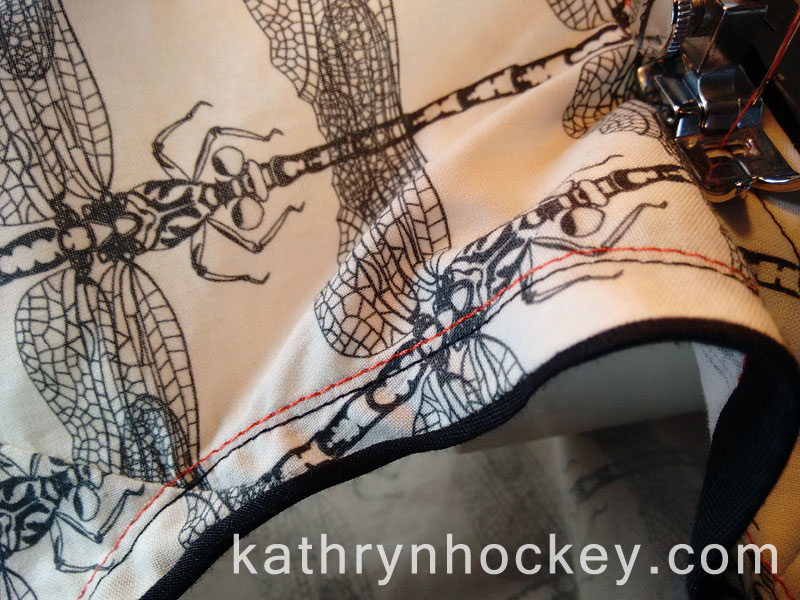
My finishing skills are improving! This time I followed my mum´s advice about French seams so the interior of the dress is much neater. dragonfly, fabric, surface design, illustration, textile design, woven monkey, dress making, dress, sewing, homemade, home sewing, made to measure

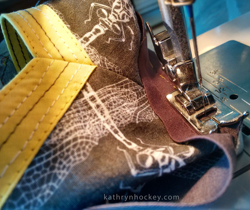
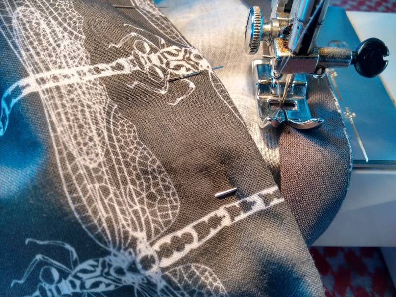
The arm holes are edged with grey bias binding with contrasting white and yellow top stitching while the neckline is finished with yellow bias binding with contrasting white and grey top stitches.

dragonfly, fabric, surface design, illustration, textile design, woven monkey, dress making, dress, sewing, homemade, home sewing, made to measure

It’s a comfy one and stylish too! 

Illustration Exhibition at the Presentation of the Play ‘Té Verde’

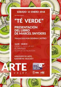
te verde, green tea, play, marcel snyders, arte vejer, exhibition, vejer de la frontera, castle, illustration, book cover, watercolour, pen and watercolour, art, drawing, painting, posterOn a rainy January afternoon my friend Marcel Snyders presented his play ‘Té Verde‘ (Green Tea in English) to an enthusiastic audience in the castle headquarters of Arte Vejer.

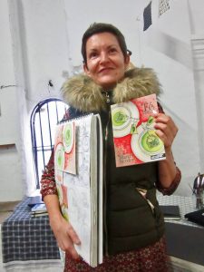
I designed the front cover for Té Verde back in October 2017 (you can read about the process here) so Marcel invited me to exhibit some of my art work during the event.

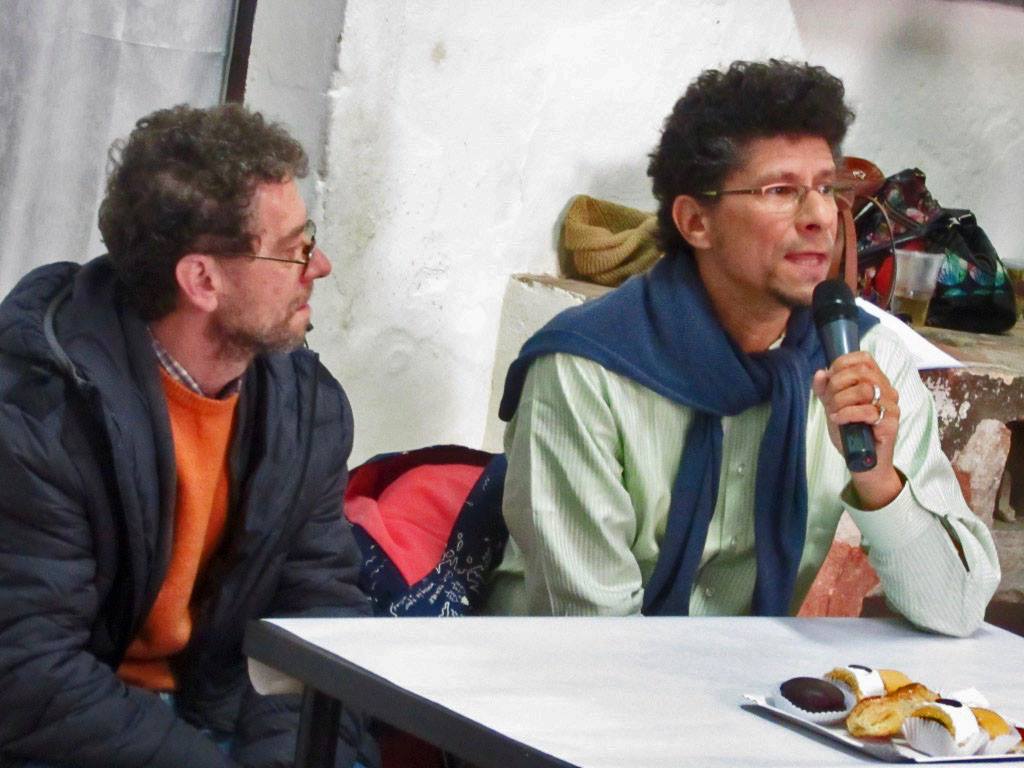
That’s Marcel (below) being interviewed by Paco Ariza Varo from Radio Vejer before Marcel interviewed me….

te verde, green tea, play, marcel snyders, arte vejer, exhibition, vejer de la frontera, castle, illustration, book cover, radio vejer, interview

te verde, green tea, play, marcel snyders, arte vejer, exhibition, vejer de la frontera, castle, illustration, book cover, watercolour, pen and watercolour, art, drawing, painting, fabric design, surface design, digital printing

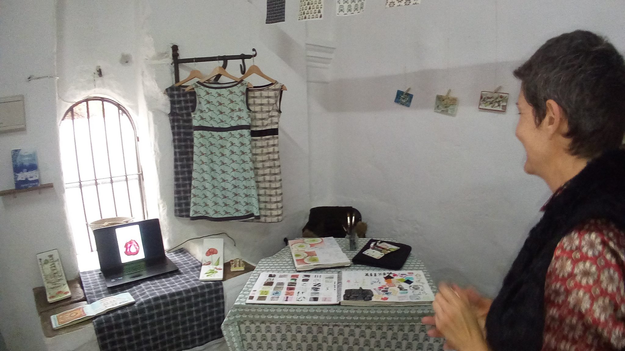
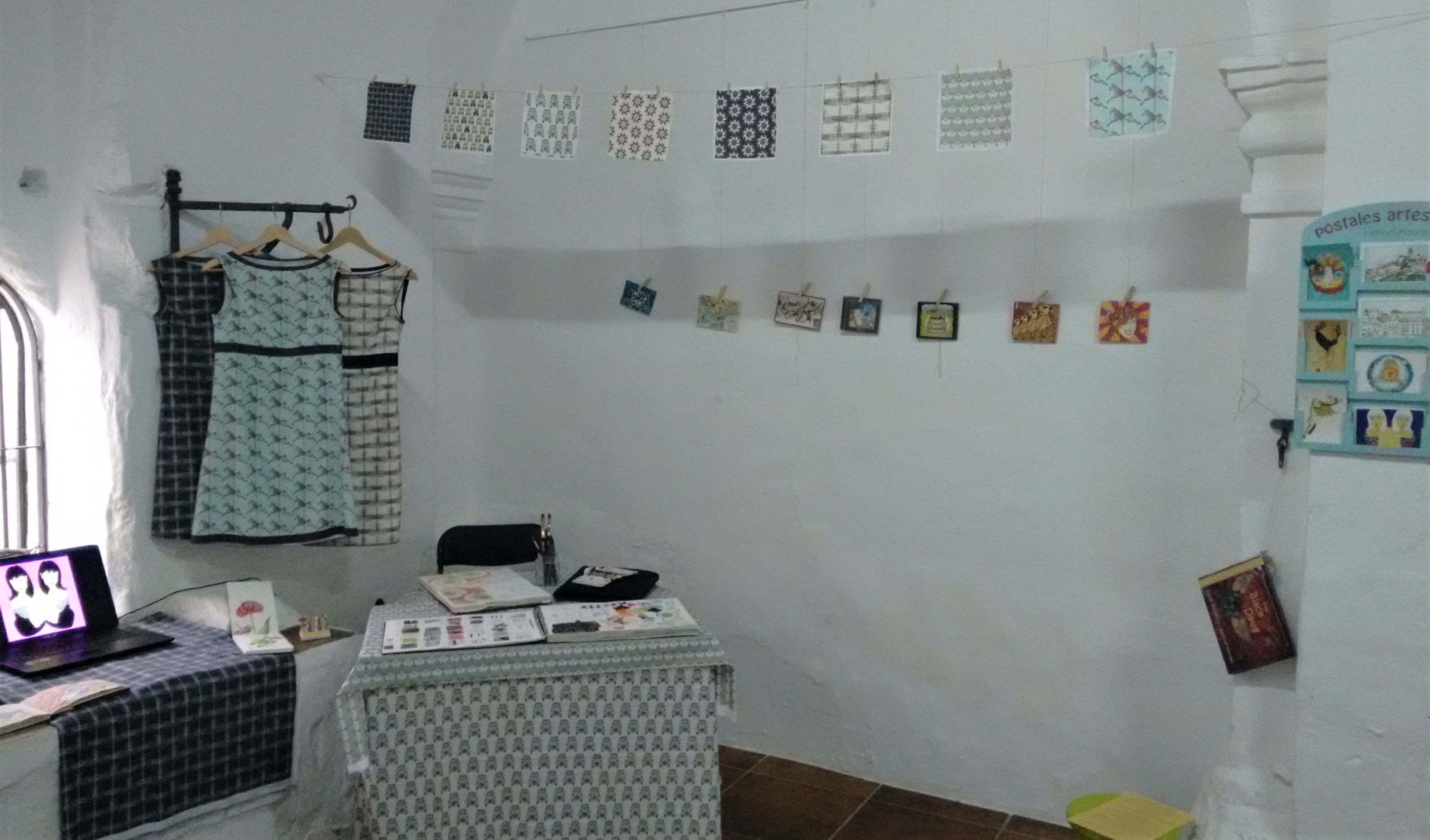
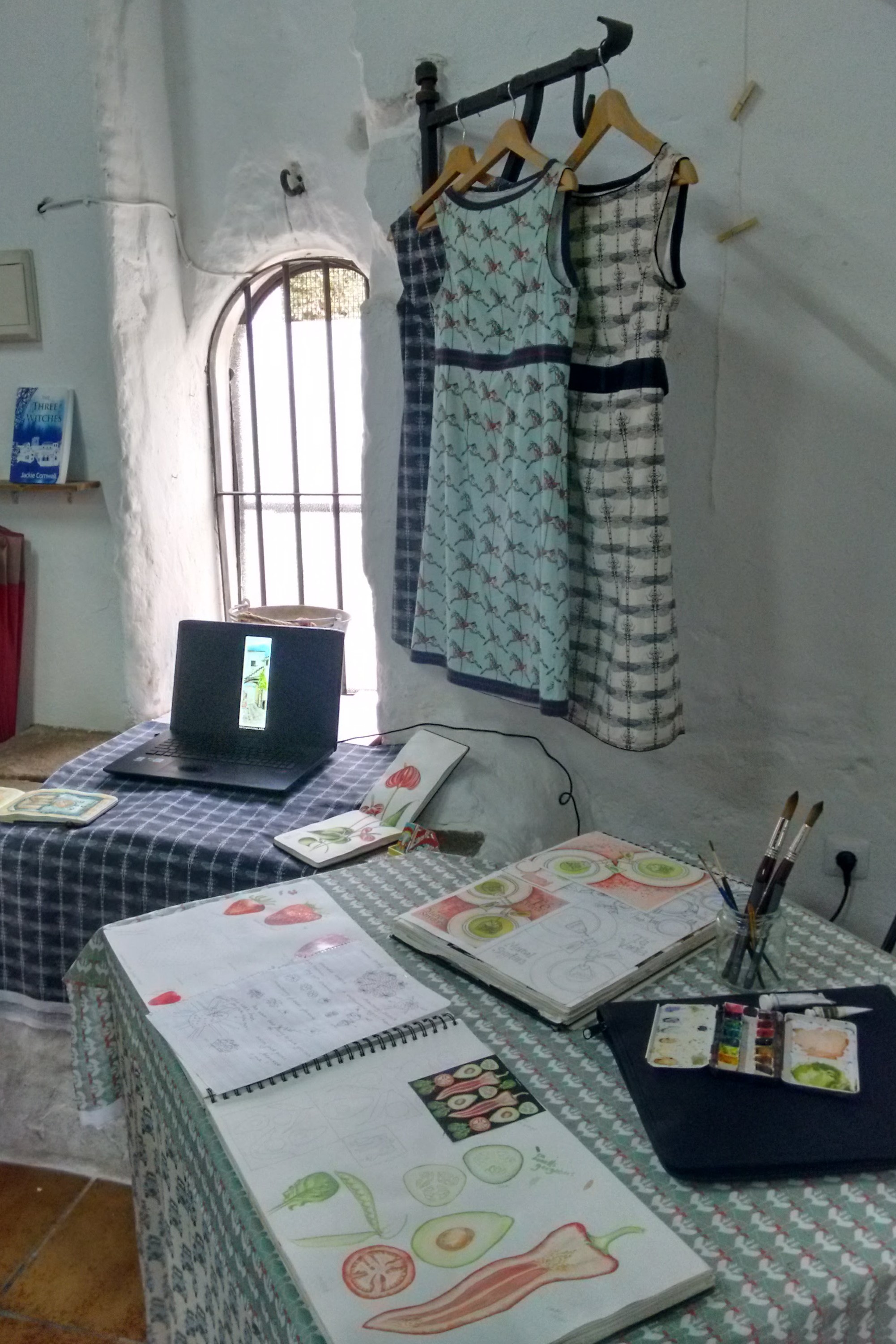
I decided to keep the exhibition small and simple so I showed a selection of my sketchbooks with my painting materials (to demonstrate the process of illustration) alongside the finished illustrations for:

postcards, the black dawg book, te verde, green tea, play, marcel snyders, arte vejer, exhibition, vejer de la frontera, castle, illustration, book cover, watercolour, pen and watercolour, art, drawing, painting, fabric design, surface design, digital printing

I also displayed some of my fabric designs (my current favourite form of illustration!) and the dresses I made from them, as well as a selection of postcards and a computer slideshow of other artworks.

sketchbook, te verde, green tea, play, marcel snyders, arte vejer, exhibition, vejer de la frontera, castle, illustration, book cover, watercolour, pen and watercolour, art, drawing, painting, fabric design, surface design, digital printing

abraham sevilla serrano, flamenco, musician, te verde, green tea, play, marcel snyders, arte vejer, exhibition, vejer de la frontera, castle,


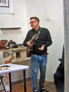
The presentation was highly entertaining, Marcel served green tea (té verde) and cakes as people arrived, two actresses from Marcel’s theatre group read the first act of the play, the flamenco musician Abraham Sevilla Serrano improvised a song dedictated to Marcel and the play (right)…

te verde, green tea, play, marcel snyders, arte vejer, exhibition, vejer de la frontera, castle, illustration, book cover, watercolour, pen and watercolour, art, drawing, painting, fabric design, surface design, digital printing


…then Marcel broke out the cava and presented me with my copy of the book


The Spanish version of the play Té Verde is now available to buy on the publisher’s website.

It’s a highly entertaining read…Good luck Marcel!

Dragonfly Tunic Dress

dragonfly, fabric, surface design, illustration, textile design, woven monkey, dress making, dress, sewing, homemade, home sewing, made to measure, invisible zip, empire line, tied back, tunic, split sides

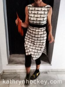
So this little number is the result of my third dress making adventure; using a black on beige version of my dragonfly fabric design which I had digitally printed in the UK by Woven Monkey.

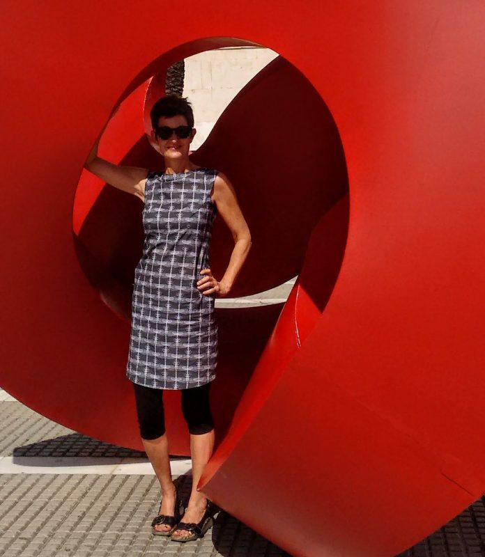
I find the boat neck / empire line combination really comfortable and flattering so I’ve continued it here but by cutting the hem straight and splitting the sides I’ve converted the dress into more of a tunic which allows for much more movement below the waist…I can run in this one but long undergarments are essential for the preservation of modesty!

dragonfly, fabric, surface design, illustration, textile design, woven monkey, dress making, dress, sewing, homemade, home sewing, made to measure, invisible zip, empire line, tied back, tunic, split sides


I wanted to make the bodice of this dress more closely fitting which meant putting in more darts and a zip. I opted to put an ‘invisible’ zip in the side seam (right) and thanks to guidance from several YouTube tutorials my first ever attempt worked pretty well.


dragonfly, fabric, surface design, illustration, textile design, woven monkey, dress making, dress, sewing, homemade, home sewing, made to measure, invisible zip, empire line, tied back, tunic, split sides


I also decided to sew on a long black ribbon to accentuate the empire line and add a bit of flounce round the back.

dragonfly, fabric, surface design, illustration, textile design, woven monkey, dress making, dress, sewing, homemade, home sewing, made to measure, invisible zip, empire line, tied back, tunic, split sides

dragonfly, fabric, surface design, illustration, textile design, woven monkey, dress making, dress, sewing, homemade, home sewing, made to measure, invisible zip, empire line, tied back, tunic, split sides

dragonfly, fabric, surface design, illustration, textile design, woven monkey, dress making, dress, sewing, homemade, home sewing, made to measure, invisible zip, empire line, tied back, tunic, split sides


While making my first two dresses – from my Dragonfly (white on grey version) and Horse fabrics – I’d come to love bias binding so I decided to use it to make a contrasting trim around the neck, arm holes and hem on this dress. I was also inspired (by a pair of black, beige and orange shorts I own) to add an orange top stitch to jazz up the black and beige combination.

Feels jolly nice on and washes well! Yay!


dragonfly, fabric, surface design, illustration, textile design, woven monkey, dress making, dress, sewing, homemade, home sewing, made to measure, invisible zip, empire line, tied back, tunic, split sides


Horse Dress

horse, sketelon, carousel, roundabout, merry-go-round, cotton, fabric, surface design, illustration, textile design, woven monkey, bias binding, dress making, shift, dress, sewing, homemade

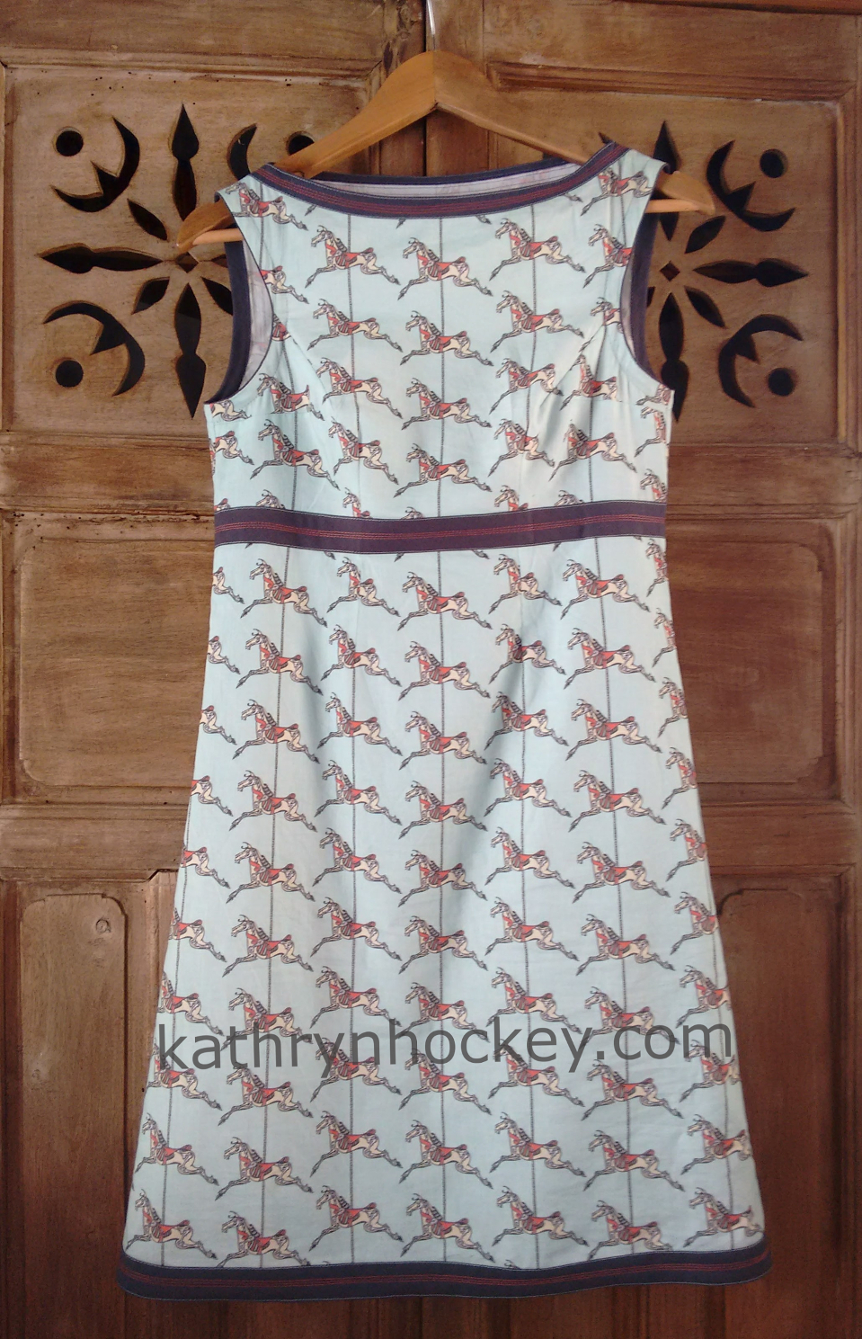
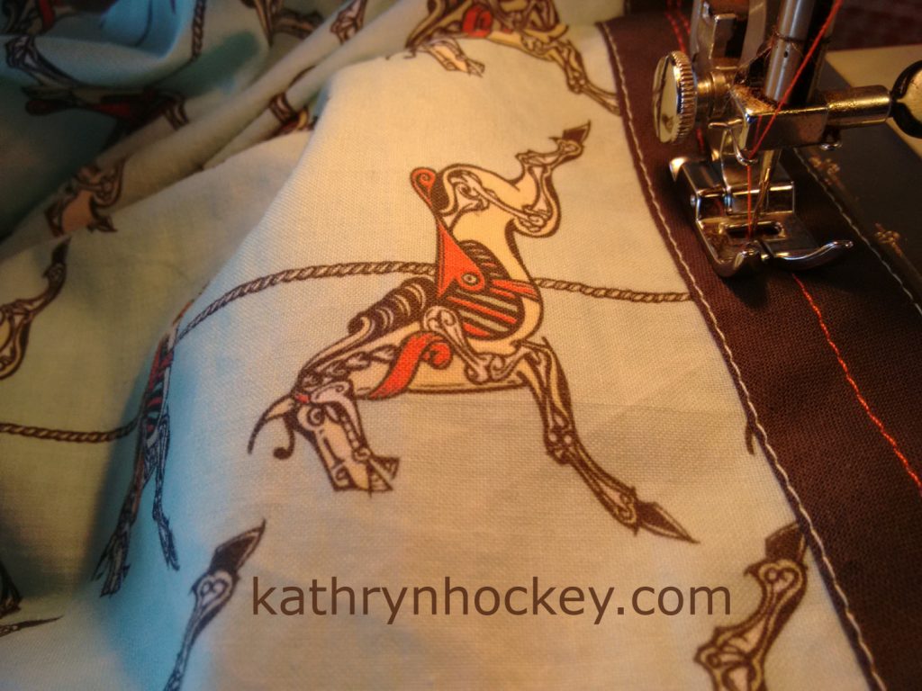
I’m jolly pleased with my horse dress; the result of my latest adventure in home sewing. It’s a variation of the first dress I ever made (a shift style sewn from my dragonfly fabric) and since I mastered the use of bias binding on that project I decided to make an external feature of it this time; embellishing it with contrasting stitching. 

horse, sketelon, carousel, roundabout, merry-go-round, cotton, fabric, surface design, illustration, textile design, woven monkey, bias binding, dress making, shift, dress, sewing, homemade

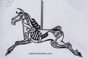
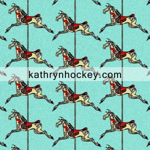
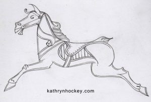
horse, sketelon, carousel, roundabout, merry-go-round, cotton, fabric, surface design, illustration, textile design, woven monkey, bias binding, dress making, shift, dress, sewing, homemade, skeleton, day of the dead, halloween, horse, carousel, fair ground, roundabout, pencil drawingThe horse motif was inspired by the extraordinarily beautiful hand painted artwork I saw when Carter’s Steam Fair visited Maldon in Essex.

I made a pencil drawing (left) using my photos for reference, taking a morbid turn by adding the skeleton of the horse as part of the decoration.skeleton, horse, halloween, day of the dead, roundabout, repeat pattern, illustration, surface design, horse, sketelon, carousel, roundabout, merry-go-round, cotton, fabric, surface design, illustration, textile design, woven monkey, bias binding, dress making, shift, dress, sewing, homemade

I vectorised the drawing in Illustrator, used Photoshop to colour it and make the repeat pattern, which I then had printed onto a light cotton by the lovely folk at Woven Monkey.

horse, sketelon, carousel, roundabout, merry-go-round, cotton, fabric, surface design, illustration, textile design, woven monkey, bias binding, dress making, shift, dress, sewing, homemadehorse, sketelon, carousel, roundabout, merry-go-round, cotton, fabric, surface design, illustration, textile design, woven monkey, bias binding, dress making, shift, dress, sewing, homemade


The dress feels lovely on, here’s me posing about in it on my 50th birthday.


Could it possibly be said that I’m flogging a dead horse? You bet!

Dragonfly Dress

I just made myself this dress with fabric printed with a version of the dragonfly design I made back in 2014.

I uploaded my design to the Woven Monkey website and they printed it onto a lightweight cotton.

dragonfly, fabric, surface design, illustration, textile design, woven monkey, dress making, dress, sewing, homemade

It’s the first dress I’ve ever made; patterns give me the heebeegeebees so I cut round one of my favourite dresses and made the rest up as I went along.

dragonfly, fabric, surface design, illustration, textile design, woven monkey, dress making, dress, sewing, homemade

It was also the first time I’ve used bias binding as I’d previously imagined it to be a right faff but there really is no other way to neatly finish neck and armholes. I watched a couple of tutorials on YouTube and bit the bias binding bullet; it’s actually quite straightforward and I’ll definitely be using it more in the future.

dragonfly, fabric, surface design, illustration, textile design, woven monkey, dress making, dress, sewing, homemade

dragonfly, fabric, surface design, illustration, textile design, woven monkey, dress making, dress, sewing, homemade dragonfly, fabric, surface design, illustration, textile design, woven monkey, dress making, dress, sewing, homemade


Here’s me doing ‘catalogue’ poses in Cádiz this week, during the dress’s first outing.


Pretty Creepy Horsey for Hallowe’en

skeleton, horse, halloween, day of the dead, roundabout, repeat pattern, illustration, surface design, This piece was inspired by the beautiful carved wooden horses of the Jubilee Gallopers carousel at Carter’s Steamfair.

horse, carousel, fair ground, roundabout, pencil drawing

I started off with a conventional pencil drawing, working from photos I had taken while visiting the fair in the summer.

horse, carousel, fair ground, roundabout, pencil drawing, digital colour, illustration

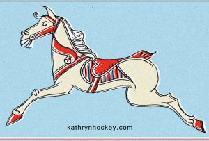
Having scanned the drawing into Photoshop I coloured it. Nice but boring, I thought…and that stripy saddle looks a bit like a rib cage…

skeleton, day of the dead, halloween, horse, carousel, fair ground, roundabout, pencil drawing

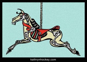
…so I kept drawing and developed the skeletal theme which I found much more interesting

skeleton, horse, halloween, day of the dead, roundabout, repeat pattern, illustration, surface design,

I scanned the new pencil drawing into my computer, vectorised it in Illustrator, then coloured and duplicated it to make a repeating pattern in Photoshop. I also added noise to the image to improve the texture.

I like the way that it’s not until you look closely that you see the dark creepiness of this image.

I’m eagerly awaiting delivery of a sample of digitally printed fabric in this design….it’s been dispatched today….dead horse cushions, anyone?!

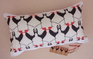
Baby Cockerel Cushion

cockerels, pattern, textile, baby, cushion, illustration


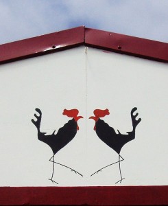
This little cockerel cushion is the latest addition to my ‘textile range‘, made from a fabric sample printed with one of my cockerel designs.


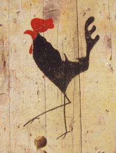
I made the baby cushion as a gift for the recent arrival who lives in the house where I sketched the original cockerel, which turned into a stencil

cockerel, rooster, cock, stencil, acrylic paint, reclaimed wood

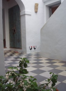
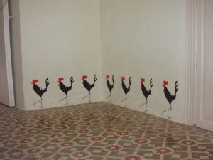
which has since adorned many walls….

Cockerel, mural, stencil

cockerel, mural, casa del arco, stencil, illustration

cockerel, mural, stencil

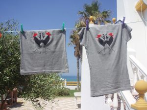
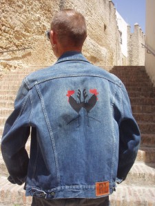
and even a few items of clothing……

cockerel, t-shirts, screen printing

cockerel, screen print, denim jacket

I was a bit sad to find out recently that despite his regal appearance the cockerel I drew was firing blanks and was put up for adoption, but he died of shock just before his new owner turned up to claim him….just shows, a cocky exterior hides a multitude of insecurities….

7 Days

7 Days‘ is the title of the fifth and final assignment I completed for my illustration course with the OCA (Open College of the Arts)

The series of 7 patterns (1 for each day of the title) was inspired by a summer boating holiday on the Canal du Midi in the south of France, and also by the wonderful woodblock designs for wallpaper and fabric of Marthe Armitage, the dramatic wallpapers featured in Sherlock the TV series and the films August:Osage County and American Hustle.

The title page shows the location:

digital collage, map of France, canal du midi

I chose 7 themes from the trip and made a motif for each, which I then multiplied to make a pattern:

Day of the 2CV
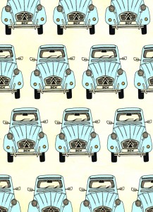
2CV, digital collage, pattern, car, illustrationDay of the Locks

Canal du Midi, lock, canal boat, digital collage, pattern

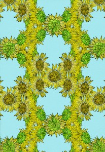
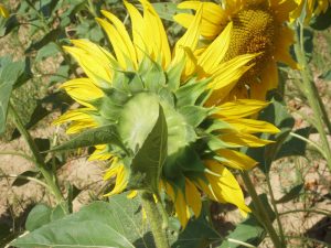
Day of the Sunflower

Sunflowers, digital collage, pattern

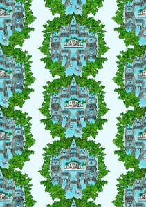
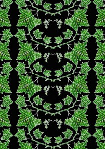
Day of the Plane Tree

Plane tree, digital collage, illustration, pattern

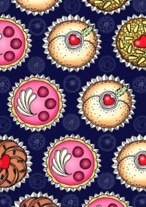
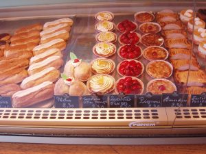
Day of Patisserie

Patisserie, cake, digital collage, illustration

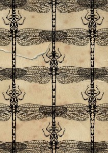
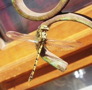
Day of the Dragonfly

dragonflies, dragonfly, digital collage, pattern, illustration

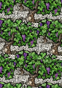
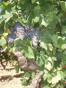
Day of the Grapevine

grapevine, vinyard, grapevines, digital collage, illustration

 My ultimate aim is to reproduce some if not all of these patterns on wallpaper, fabric and other surfaces.

The method was pretty much the same for each pattern; here’s an outline:

  1. Research photos and sketches made on the spot
  2. Preliminary sketches from the initial research images
  3. Pencil or pen drawing from the sketches
  4. Drawing scanned to Photoshop where the line work was cleaned (by adjusting brightness/contrast, duplicating with the layer blend mode set to multiply and using the eraser tool) and cut out
  5. Colours and textures added in Photoshop layers using scanned handmade collages and marbling, bought papers, flat and graduated digital Photoshop colours and textured colours in Corel Painter12
  6. Duplication of the coloured single unit
  7. Adding a background of flat digital colour or scanned paper
  8. Adding texture to the background

For those who are interested in seeing  the production method for each image in more detail I’ve added them below:

Title page

For the background I made a map of Europe by tracing the outline in pencil onto squared paper
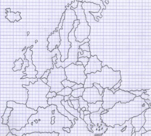
traced-europe-map-kathryn-hockey-artist-illustrator

which I then scanned to Photoshop and inverted
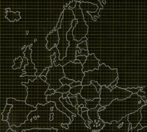
I then collaged the map in Photoshop layers with some bought paper
and marbling I had made using oil paints
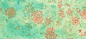
and a French flag which I found through an internet search
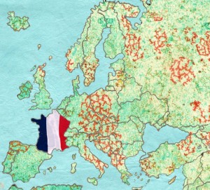
I distorted the map with the free transform tool and applied my inverted outline of a plane tree and grapevine pattern (methods below), adjusting the layer blending modes, tone, saturation, curves and levels in Photoshop.
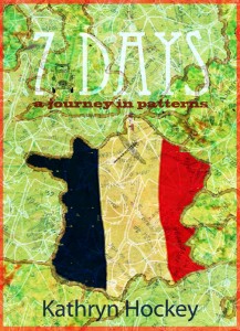
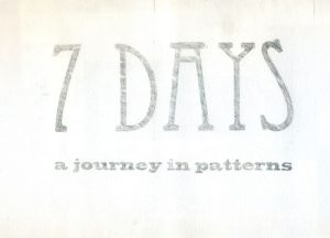
I printed the text ‘7 Days a journey in patterns’ from Photoshop , traced it in pencil and scanned the tracing back into Photoshop where I coloured / inverted it

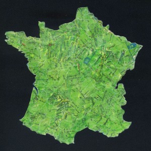
I wanted to show the location of the Canal du Midi, so next I made a collage of another map of France I found through an internet search, applying torn fragments from a French road atlas
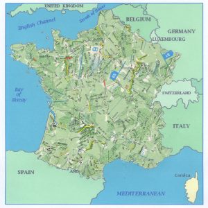
working over it in water soluble green crayon and a wash of acrylic paint
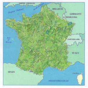
before applying a crackle glaze and white acrylic paint to highlight the cracks and scanning it into Photoshop
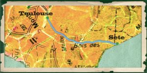
I traced the outline of the canal in Corel Painter layers from this map I found on the internet and applied it to my cropped collaged map in Photoshop, adjusting the tone and saturation, adding text to mark Toulouse and Sete (the towns at either end of the canal), and creating a border using the brush tool and a scan of aged paper in layers.
I had a practice run at labeling France on a print out my map of Europe (to which I’d applied a crackle glaze and white acrylic paint) with collage and biro
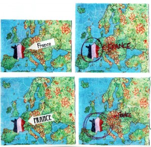
I cut out the collaged label of the lower left version in Photoshop and applied it over my background, including a smaller duplication of the ‘flagged’ France and a smaller duplication with reduced opacity of the Canal du Midi map over the larger ‘flagged’ France map
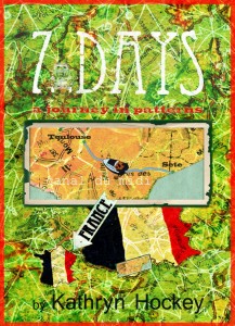
Finally, in Photoshop, I adjusted the tone and saturation of the background to improve the contrast, added and coloured a boat from the locks pattern (see below) labelled the Canal du Midi on the larger map insert and added an inverted outline of the 2CV drawing (see below).

Patterns:

2CV
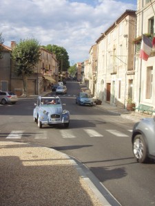
Research photo taken in France, I also referred to a photo I found on the internet
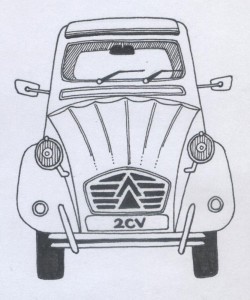
Pen drawing
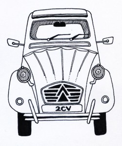
Scanned to Photoshop, line work cleaned and cut out
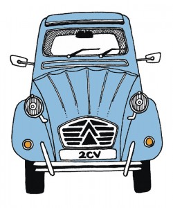
Coloured in Photoshop

2CV, car, digital collage, illustration

Curves adjusted, image duplicated and scanned paper added in Photoshop layers for background texture
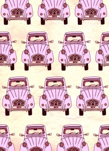
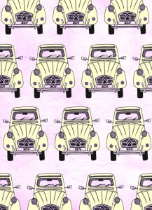
2CV, pattern, car, digital collage, illustration 2CV, car, pattern, digital collage, illustration

Tone adjusted to achieve different coloured versions

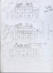
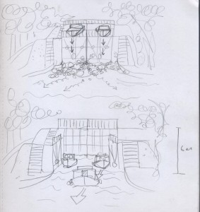
Locks
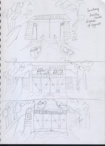
3 sketches made on site to show how the canal boats go ‘up and down hill’ via the lock system
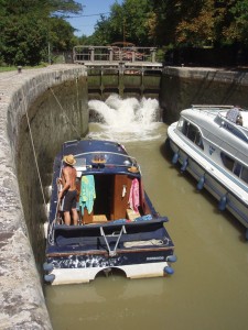
1 of many, many photos I took of the boat in a lock
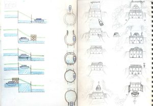
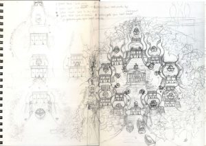
A series of sketches I made to work out how to show how boats move up and down stream through the lock mechanism in ‘3D’
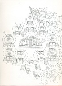
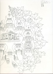
I traced the final sketch, made a pen drawing and scanned it to Photoshop in 2 parts
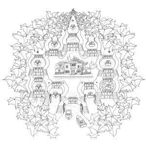
The line work is cleaned, duplicated, aligned and cut out in Photoshop
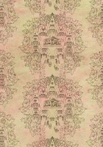
Outline duplicated in Photoshop layers on a scanned paper background with stripes added with the brush tool
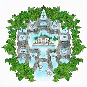
Canal locks, digital collage, illustration

Collage and colour applied to the line work in Photoshop layers: leaves with the collaged map of France (see above); water with the brush tool; locks with the photo of concrete shown below
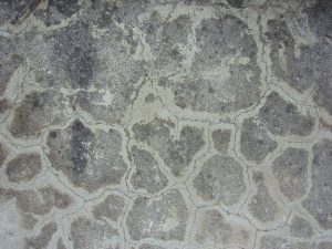
Locks, canal, canal du midi, lock diagram, digital collage, illustration

Finally the single unit is duplicated and stripes of scanned blue paper are added in Photoshop layers. I also added a final outline layer over the top to improve definition. The repeated unit is reminiscent of the form of Tibetan thangka art

Sunflowers
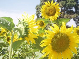
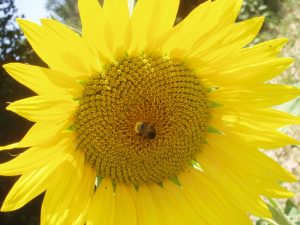
Research photos taken on the spot
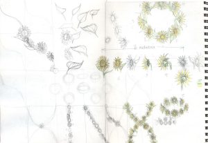
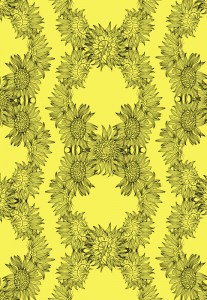
Rough sketches for possible pattern layouts, I wanted to show the sunflowers rotating, as if towards the sun
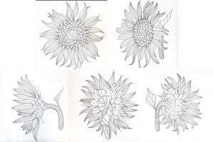
Pencil drawings
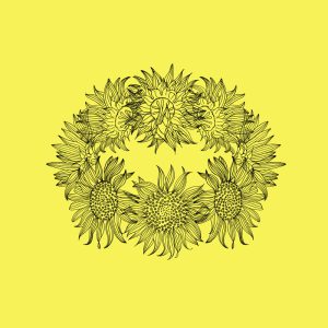
Sunflower1-kathryn-hockey-artist-illustrator-web

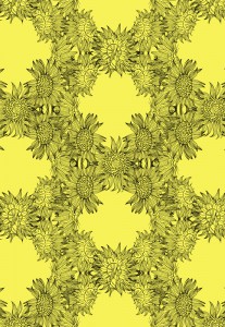
Drawings scanned to Photoshop, line work cleaned, trimmed and cut out
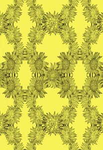
Sunflower-3-kathryn-hockey-artist-illustrator--web

Pattern trials made by duplicating layers in Photoshop
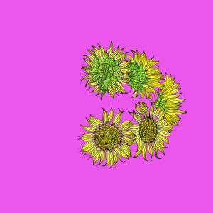
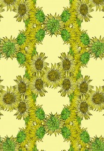
Sunflowers coloured in Photoshop layers: yellow centres and green parts collaged with different tonal versions of the France collage map (see above); petals with flat and graduated digital colour
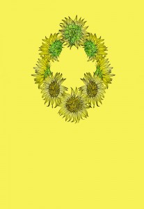
Collaged sunflowers duplicated to form single unit of repeat
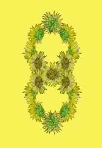
Single unit duplicated and flipped vertically
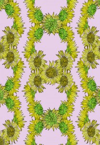
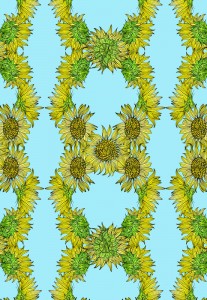
Sunflower-blue-kathryn-hockey-artist-illustrator-web

Colour and pattern trials

Sunflower-blue-collage1-kathryn-hockey-artist-illustrator-web

I finally settled on a blue background, to represent the summer sky, adding texture to it via a scanned canvas

Plane Tree

Planted between 1681-1810, plane trees line long lengths of the Canal du Midi and are dying because of a fungus but I decided not to portray the dying trees in favour of ‘aesthetic delectation’.
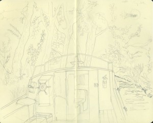
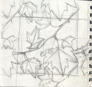
Sketch made on site
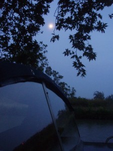
plane-tree-photo-kathryn-hockey-artist-illustrator-web

1 of many research photos taken on site, I also referred to this Natural History Museum photo
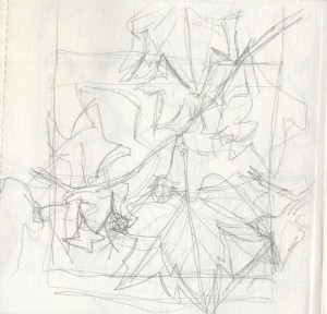
Plane-tree-pattern-sketch2kathryn-hockey-artist-illustrator-web

Rough sketches to work out a single repeating unit
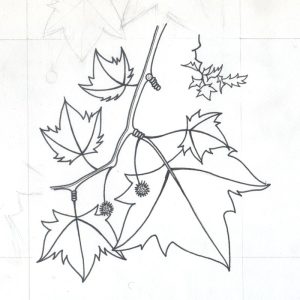
Pen drawing of the single unit
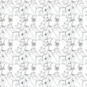
Single unit duplicated in Photoshop layers
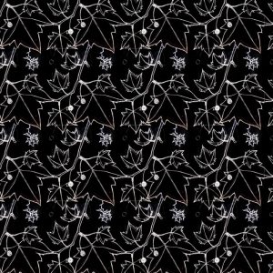
Pattern line work inverted
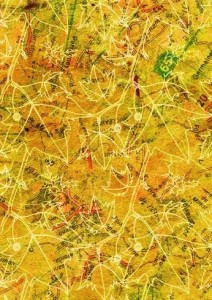
Yellow tonal version of my collaged map of France added as a background to the inverted cut out line work. It overpowered the pattern which lacks definition
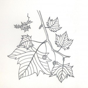
I redrew the single unit in pencil, adding more detail
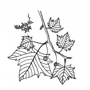
Drawing scanned to Photoshop, line work cleaned and cut out
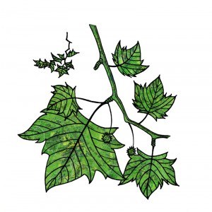
Plane-Tree-collage-kathryn-hockey-artist-illustrator-web

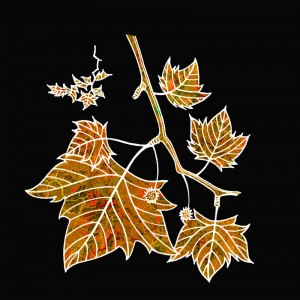
Collaged in Photoshop layers with my France collage map
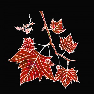
Line work inverted and tone of collage adjusted, I love these autumnal shades but my pattern needed to be summery green
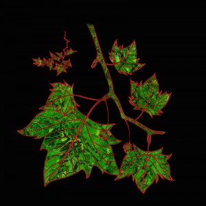
Layer effects applied to inverted line work
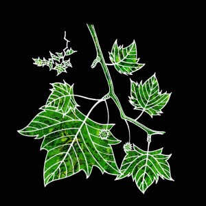
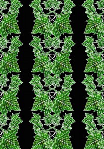
The version I decided to repeat
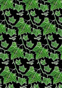
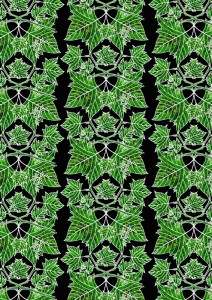
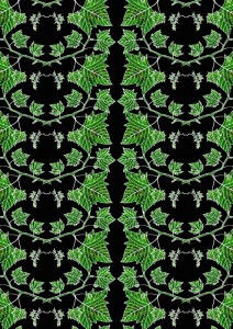
Pattern variations

Patisserie
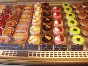
Research photos
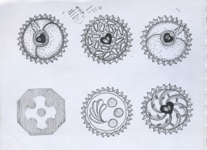
Pen drawings made from photos
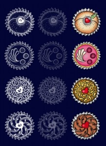
Drawings scanned to Photoshop, line work cut out, inverted, duplicated and coloured in Photoshop and Corel Painter12
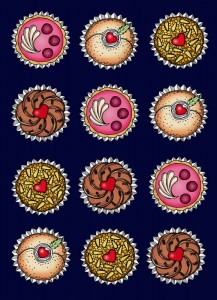
Coloured cakes duplicated to make a pattern
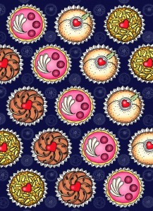
cakes, patisserie, digital collage, illustration

 Inverted line work introduced to background to add depth, subtle granular texture added

cakes, patisserie, digital collage, illustration

Closer crop

Dragonfly

Research photo
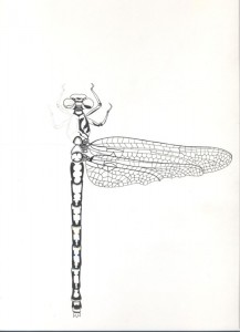
Partial pen drawing
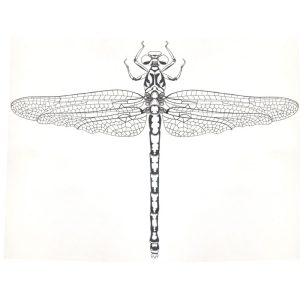
Drawing scanned to Photoshop, cleaned, part duplicated and flipped horizontally
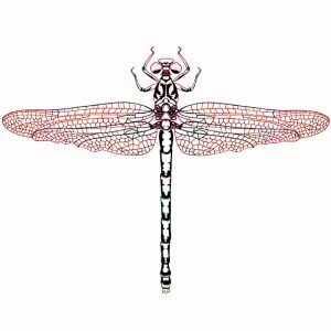
Playing with tone and saturation settings
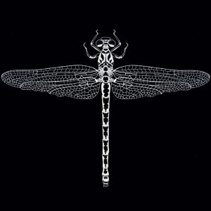
Line work inverted
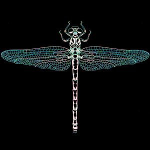
Playing with tone and saturation settings for the inverted version
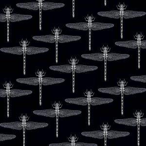
Inverted line work multiplied
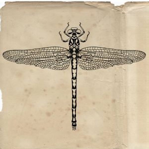
Line work on a scanned paper background
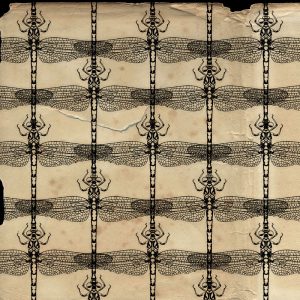
Multiplied

A4 crop

Grapevine
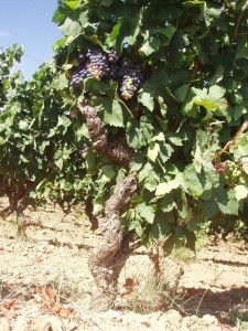
Research photos
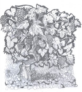
Preliminary sketches from photos
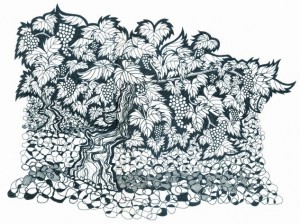
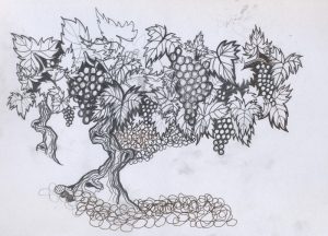
Pen drawing
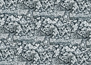
Scanned and duplicated
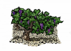
The single unit was collaged in Photoshop layers with the following material:
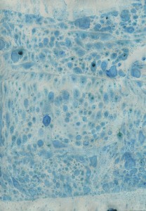
marbling I made with oil paints
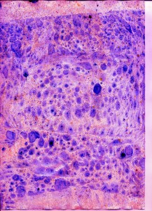
scanned to Photoshop and tone/saturation adjusted for the grapes

my collaged France map for the vine leaves
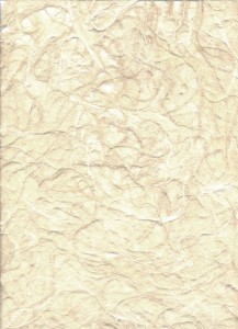
textured paper for the ground
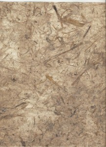
textured paper for the vine trunks
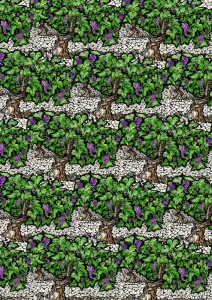
The duplicated collage

A closer crop