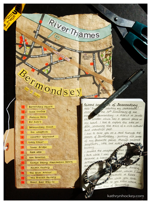
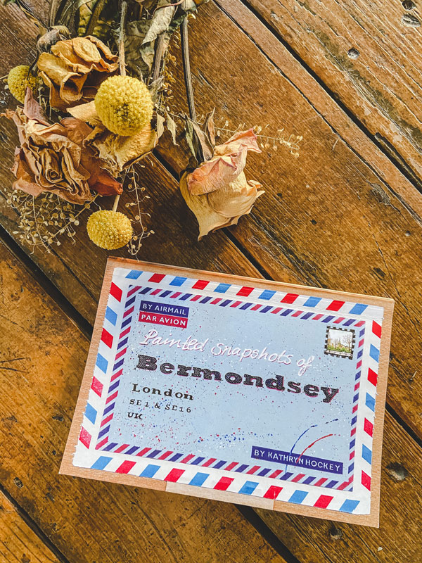
2020 marks the 30th anniversary of me moving to Bermondsey. Although I’ve spent about half the time since then living in and traveling through other places it’s always fascinating to return to Bermondsey, which has a special place in my heart. I love to explore the area on foot, savouring the relics of a rich cultural and industrial past that sit alongside ever evolving modern developments. Old factories, railway arches and warehouses are re-vamped and re-purposed and new buildings and independent businesses bring a fresh flavour to the neighbourhood.
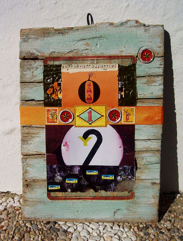
That’s why I chose Bermondsey as the subject for my sketchbook project for The Brooklyn Art Library. I aim to take you on a stroll through its streets, pointing out some of my favourite buildings through sixteen painted snapshots, little love notes and some history bits which, if the fancy takes you, you can expand on by clicking the highlighted blue links.
The sketchbook process…
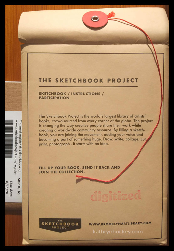
I ordered the sketchbook from the Brooklyn Art Library at the end of 2019, planning to paint the urban landscapes from photos as a spring project while staying with my parents who live outside London in the Essex countryside. Taking those reference photos made my walks more purposeful, my observation more focused and my routes more diverse.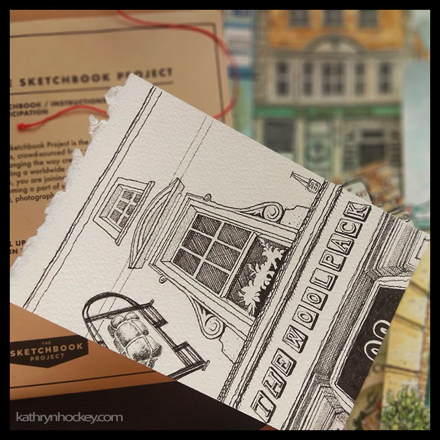
The looming Corona virus lockdown meant that I decamped from Bermondsey to Essex a couple of weeks earlier than I’d planned so there were some places I didn’t get around to photographing; the riverside for instance. Even so I had plenty of reference material and found it hard to choose which parts to leave out.
My sketchbook project is now a poignant homage to all those lovely artisans, independent businesses and traders who are shut down and all the residents who are shut inside during these strange, socially isolated and unsettling times. My perspective has shifted from ‘fear of missing out’ to a fervent hope for everyone’s survival in our new ‘Covid World’.
Bermondsey is a district in the borough of Southwark (created in 1965 and pronounced ‘Suthuck’) in south east London. Its name is derived from ‘Beornmund’s Ey’. Beornmund being the name of a person and ey being an Old English word meaning an island, a place by a river or stream, or a piece of firm land in an area of marshland.
Bermondsey is bordered by the districts of Southwark to the west, St Katharine’s and Wapping to the North (on the other side of the River Thames – pronounced ‘Tems’), Rotherhithe to the East, Deptford to the southeast and Peckham and Walworth to the south.
In 2018 The Sunday Times newspaper calculated that Bermondsey was the best place to live in London; this year it came 4th – which is still pretty good!
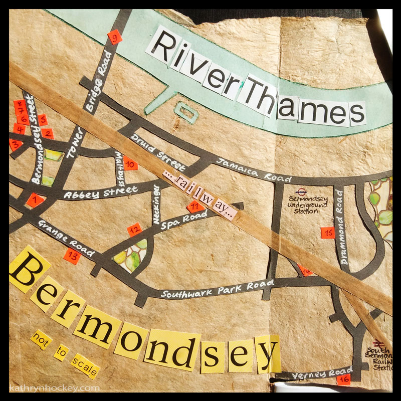
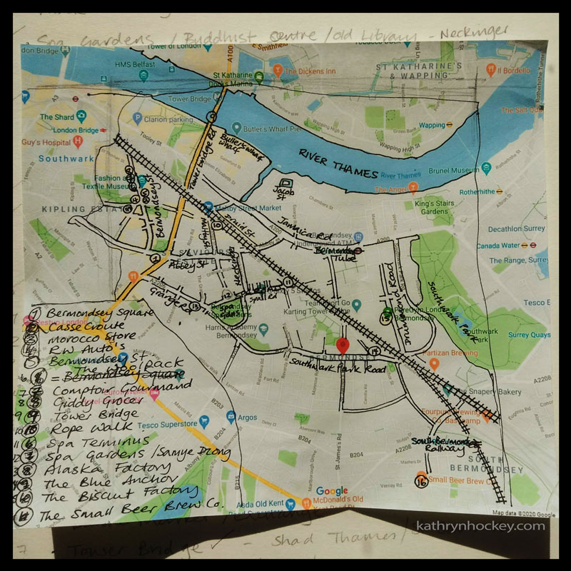
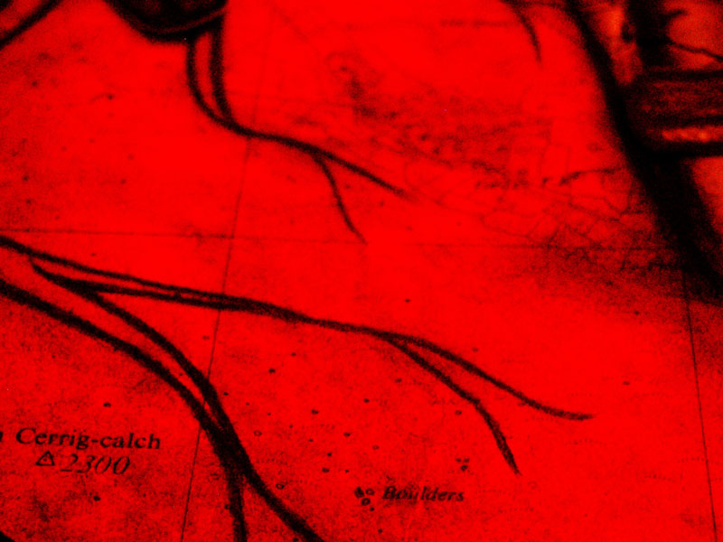
Here’s a map I collaged to help us orientate ourselves as we check out Bermondsey’s visual treats and singular history…
Bermondsey Square
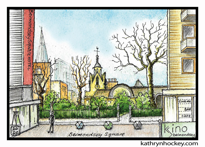
So we’re starting our tour in Bermondsey Square looking north across Abbey Street at St Mary Magdeleine church. The first record of a church on this site comes from 1290, it was rebuilt in 1690, amazingly survived the heavy bombing during the Blitz of World War 2 and contains a remnant (approx 25 feet high) of the late medieval tower. The tombs of the Rolls family, of Rolls Royce fame, are in the church gardens.
Abbey Street is so called because there was an Abbey in Bermondsey Square with truly ancient origins. I’ve outlined its history with bullet points for clarity:
- Pope Constantine (708-715) granted privileges to a monastery at Vermundesei which was then under the control of the Abbott of Peterborough
- Some time between 830 and 842 the monastery was destroyed in Viking raids which were common in London and south east England at that time
- 1082 the monastery (the residents were monks) was rebuilt and dedicated to Saint Saviour (another name for Jesus) by a city fat cat called Alwinus Child
- 1086 the Doomsday Book (a national survey ordered by King William the Conquerer) lists a ‘new and handsome’ church amongst the assets of Bermundesy, also referred to as Bermundesye
- 1089 the monastery became a priory (led by a prior) attached to the French Abbey at Cluny, part of the Benedictine order
- 1380 the first English prior paid to have the priory naturalised so that it wouldn’t be attacked as ‘foreign’ property if there was a war with France
- 1390 independent status was achieved and the building became known as Bermondsey Abbey (it was led by an abbott, a rank higher than a prior)
- It quickly acquired a lot of land and property, becoming hugely rich and powerful and an important spiritual centre to rival Westminster Abbey. In 1535 its income was equivalent to about £17 million in today’s money
- 1537 the abbey was dissolved by King Henry 8th as part of his bust up with the Catholic Church, he gave it to his courtier Sir Thomas Pope who broke up the buildings and built himself a mansion
There’s a fascinating video here describing the excavation, recording and preservation of Bermondsey Abbey’s ruins (and the human remains buried there) before the regeneration of Bermondsey Square which started in 2006.
In the painting above you can also see the Bermondsey Square Hotel (left) and the Kino Cinema (right), which opened in 2008; both delightful results of that multi-million pound regeneration project. The pointy Shard is just visible in the background. The Shard is not in Bermondsey but it’s so tall that it’s clearly and widely visible from street level and it serves as a useful reference point.
The heavy bombing during World War 2 drove many businesses and residents out of Bermondsey for good and Bermondsey Square was pretty much derelict. In 1947 the large antique market at Caledonian Road in north London was moved to Bermondsey Square. Until 1995 a medieval law made it possible to sell (or fence) stolen antiques and artworks between dusk and dawn at ‘open markets’ like Bermondsey without being arrested which led to its scandalous reputation for dodgy dealings for a few years. The antique market continued to be held every Friday morning from 1947 through the regeneration project of 2006-8 until the Corona virus lockdown which started in March 2020.
Sherman & Waterman share a complete history of Bermondsey Antiques Market on their website.
Bermondsey Street
Now we’re going to cross Abbey Street and turn right up Bermondsey Street.
It’s a road which is at least one thousand years old and contains, all within about a mile: multi-million pound warehouse conversions; social housing; two 200-year-old alehouses both of which still serve ale; a whole host of restaurants offering food from around the world; a couple of thoroughly modern museums; tiny galleries; a traditional ‘greasy spoon caff’; independent artisans and traders selling arts and crafts, fresh fruit, veg and baked goods; a vintage/designer clothing boutique whose profits go to charity, to name but a few. It’s an authentically buzzy, busy road is Bermondsey Street. That’s why I love it. It’s ambience has changed quite a bit though…
In 2014 ‘The Gentle Author’ wrote this charming and evocative description of Bermondsey Street on their Spitalfields Life website:
“There is an engaging drama to Bermondsey St with its narrow frontages of shops and tall old warehouses crowded upon either side, punctuated by overhanging yards and blind alleys. A quarter of a century ago, everything appeared closed down, apart from The Stage newspaper with its gaudy playbill sign, a couple of attractively gloomy pubs and some secondhand furniture warehouses.”
But even back then I liked it.
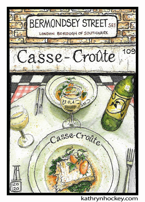
Cassically French in design and cuisine, cosy Casse Croûte sits about half way up Bermondsey Street on the corner with Tanner Street. I went there with a childhood friend and ate delicious halibut risotto on a cold, rainy night in early March (as news of the effects of the Corona Virus pandemic in Italy was emerging). It’s a tiny, friendly place and features in the Michelin Guide. I was beguiled for some time before my visit by the view through the window of the black and white tiled floor in combination with the red gingham table cloths and the rustic French deco, so it was lovely to find out first hand that the food and service are exceptional too.
Now for some less savoury information: Tanner Street is named for the leather trade which was in full swing in 18th century Bermondsey. It caused a vile stench; they used dog poo (collected from the streets and pedigree dog breeders) mixed with urine to soften the skins and relied on the high tide to wash out the filthy tanning pits twice a day. If you squint hard at this map from 1787 you can see the Tan Yards laid out next to Long Lane near Bermondesy Square.
And in this photo from 1962 you can see The Grange Tannery site, which covered two and a half acres between Grange Walk (formerly called Horney Lane) and Spa Road and became famous for making the red leather despatch boxes used by the UK Government. The tanneries in the Grange were bombed to bits in the World War 2 Blitz and were replaced by residential and office blocks.
There’s a pub called Simon the Tanner on Long Lane to this day. Also pertaining to the skin works are: The Woolpack pub, Leathermarket Street, (renamed from Market Street just before the tanning trade died out) and The Alaska Factory (all coming up below). The beautiful London Leather, Hide and Wool Exchange building is sadly not included in my drawings.
We’ve crossed Bermondsey Street now and we’re taking a tiny detour onto Morocco Street (formerly called Upper Russell Street – pictured here in 1828) to take a look at a couple of very unusual buildings; each stunning in a very different way.
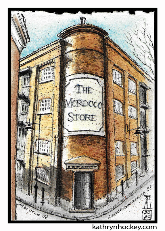
The Morocco Store is an old warehouse converted into a private residence. I love the curved brick part which sits right on the tight corner between Morocco and Leathermarket Streets; it looms up like a big old chimney. The Morocco Store sign, painted directly onto the bricks, is a work of art in itself although I now read that it was painted by the owner to suggest a ‘fictional and whimsical’ past and raise the value of the building – it had me fooled!
In this photo from 1969 the sign is much less poetic, reading ‘Turner Whitehead Industries Ltd Polythene’.
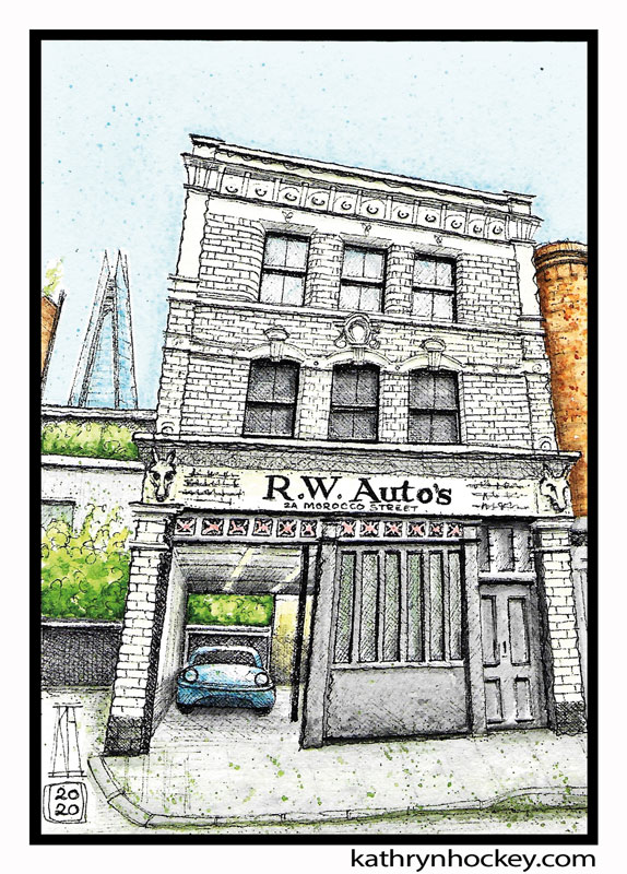
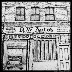
I’m a sucker for an exterior glazed brick – oh my, and white ones…the loveliest of them all. The carved horses’ heads on the front of this car repair shop reveal that it used to be a coach house with a blacksmith’s forge out the back where horses could get their shoes changed. RW Auto’s is still working hard to keep people on the road but now on four wheels instead of four legs. And there’s the Shard again, peeping over the wall.
“Just found this article about Bermondsey. I can recall right back to when I was living in Kinross Street which is now part of the park where Tanner Street meets Bermondsey Street. And yes, I can remember the Farrier on the corner of Morroco Street. I used to watch fascinated as the big shire horses were being shod. Probably horses that belonged to Tommy Hatcher as that was the local haulier. I particularly remember the smell when the hot shoes were put on the hoof. My brother and I would chase after Tommy Hatcher’s carts and hang off the back. The time was 1946/47.”
Here are some links to old photos of the building, with one horse’s head missing in 1976 and 1981 but the other doing well in 1969.
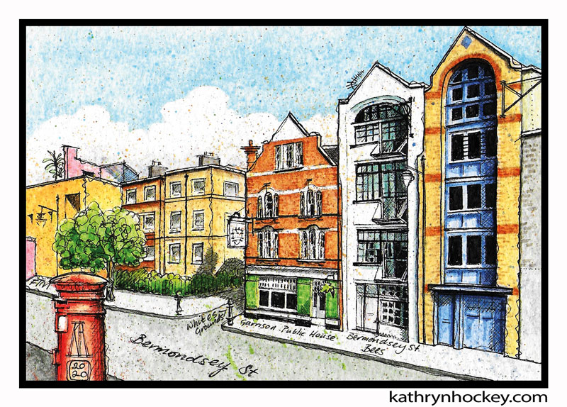
OK, we’ve turned around and we’re back on Bermondsey Street. You have my word that I did not exaggerate the colours of any of these buildings, they really are that bright and beautiful.
We can see two converted warehouses to the right, the yellow brick one with the mauve paint is a multi-million pound private residence and the white one is the headquarters of Bermondsey Street Bees.
Bermondsey Street Bees is a sustainable bee keeping practice founded in 2007 by a bee keeper and a honey sommelier. They’re dedicated to the promotion of the care and survival of bees along with the production of award winning raw honey.
The red brick building with glazed green brick around the ground floor has been home to the Garrison Public House restaurant since 2003. There’s been a pub on this spot for about 200 years; in 1822 The Yorkshire Grey was recorded in the Licensed Victualler Recognizances meaning that the owner had pledged a bond (promised money) in court to guarantee that the alehouse wouldn’t be a nuisance to the neighbours. It was definitely a nuisance at some point – there’s a bullet hole in that plate glass window. I kid you not. In 1998 The Yorkshire Grey became the The Honest Cabbage restaurant where I worked on and off for a couple of years with a fun team including one of my best friends, who lived in Whites Grounds just, around the corner.
The two buildings on the other side of Whites Grounds are council flats; social housing run by the local authority, Southwark Council, for local families on lower incomes.
The orange and pink building was designed by Mexican architect Ricardo Legorreta and houses the Fashion and Textile Museum (FTM) which was founded in 2003 by the flamboyant, pink haired clothes designer Dame Zandra Rhodes to showcase contemporary fashion and textile design. It’s now run by Newham College.
Now, if we stay on this side of the road and walk a few steps past that postbox we’ll get to…
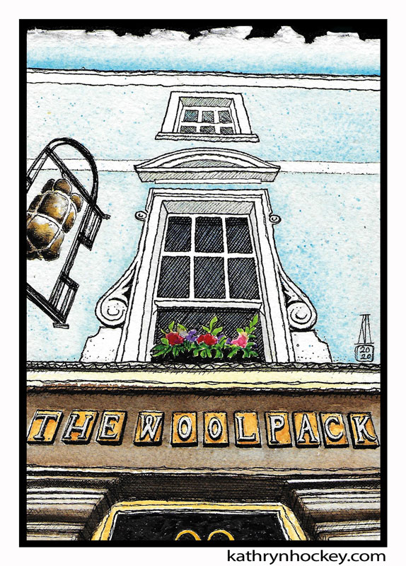
The Woolpack pub, where I used to hang out and play pool (in the upstairs room behind that elegant window) at the end of the 90s when I worked at the ‘Cabbage’ over the road.
According to insurance records there was a pub on this site from 1790 called The Cock and Magpie (also referred to as The Cock and Magpye and The Cock and Pye). In 1837 its name changed to The Woolpack.
The building numbers on Bermondsey have changed a fair few times in the past so before 1851 The Woolpack was number 205, now it’s number 98.
The sun was shining brilliantly the day I took this photo; I was struck by the blue painted front against the blue sky and how the flowers in the window box shone like jewels against the darkness of the window. I also liked the view of the hanging wool pack from this perspective, the lovely lines of the windows and the beautiful letters which spell out the name.
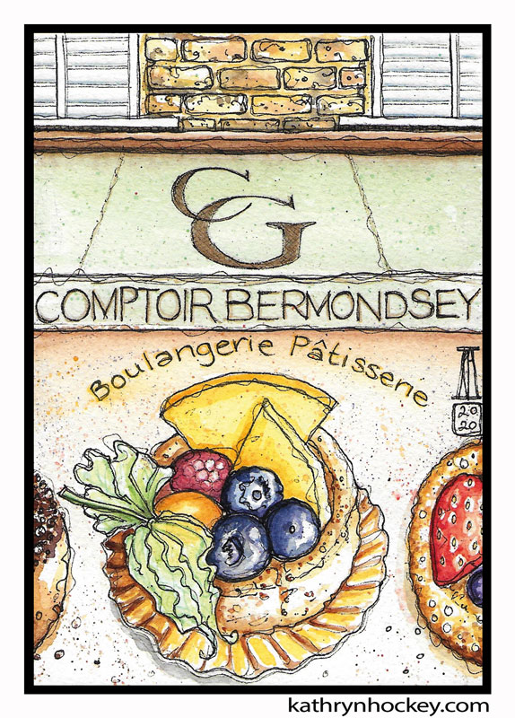
Do you love bakeries? Oh, me too! And I could stand and gawp at the pastries, tarts, mini quiches and macaroons in the Comptoir Gourmand window for more time than is socially acceptable if I were less self conscious. Patisserie window shopping…one of my favourite pass-times. I also love to paint food…then eat it.
These delights are actually made in the Comptoir Gourmand bakery on Rope Walk, I’ll point that out to you later as we pass close by…
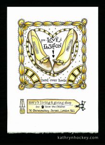
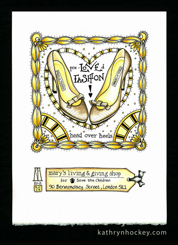
A little aside about Mary’s Living and Giving Shop, which I haven’t sketched but is worth a mention. In 2009 retail expert Mary Portas, ‘Queen of Shops’, worked with the Save the Children charity to set up Mary’s Living and Giving shops. The creme de la creme of donated items, including designer wear and high quality, new or hardly worn items are diverted to specially designed boutiques where their resale can earn the most money for the charity.
While I volunteered in the Bermondsey Street branch for a few happy months in 2018 I did some window painting, chalkboard writing and a series of ‘pre-loved fashion’ illustrations.
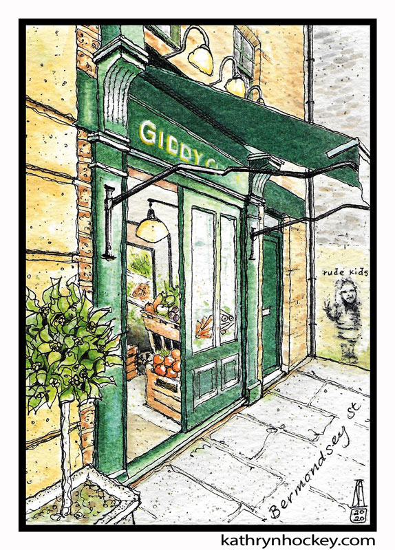
I love this tiny shop so much. It’s always a visual treat as much as a tasty treat to go to the Giddy Grocer and if ever I’m going to eat with or stay with friends I’ll do my best to get some edible offerings from here. The Giddy Grocers are so committed to supplying their neighbours with local goods and fresh produce that they’ve kept the shop open throughout lockdown, adapting the way they sell to ensure that everyone stays safe. I’d love to sketch inside the shop one day…The B Street Deli, a lovely eating place a few doors down Bermondsey Street is also under the Giddy umbrella.
The ‘rude kids’ stencil art on the wall in the background was painted by Dotmaster in 2015.
Now we’re going to walk to the northern end of Bermondsey Street, take a right, meander under the railway arches and head to the river to marvel at one of the most famous landmarks in the world…
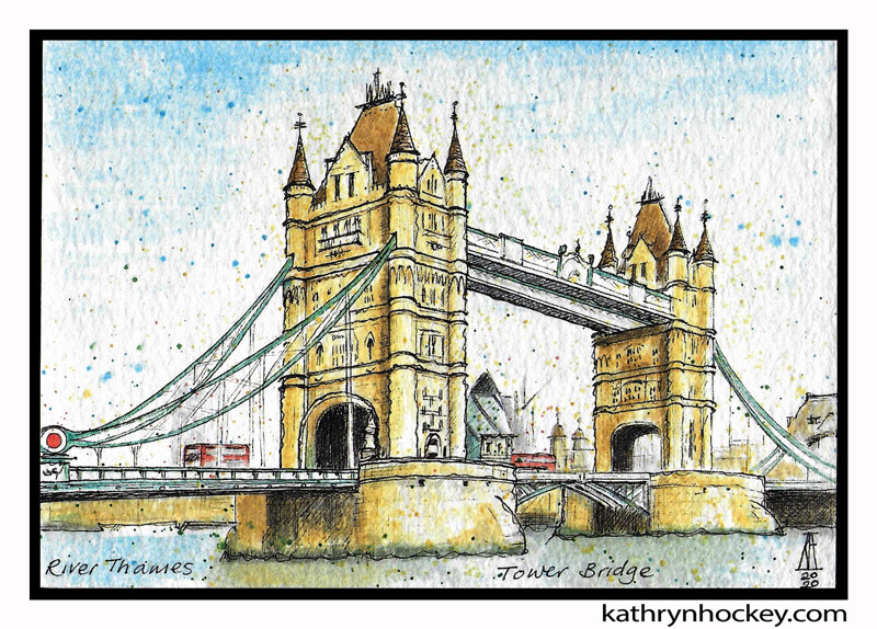
Tower Bridge! A fantastic combination of Victorian high camp and engineering genius – Tower Bridge spans the River Thames (pronounced ‘Tems’) like a big fancy cake. It’s often wrongly referred to as London Bridge which is hardly surprising since Tower Bridge is an iconic symbol of London and London Bridge is really quite plain.
Tower Bridge was commissioned by the City of London Corporation because they wanted a river crossing to the east of London Bridge capable of letting tall ships through. In 1876 they opened a design competition to see who could come up with the best solution and eight years later Horace Jones and John Wolfe Barry cracked it with their combined suspension and bascule confection. The bridge took another eight years to build.
The bascule, which is French for see-saw, is the bit in the centre. The two road level sections can each be pulled up on a pivot at one end to create a gap between the two towers that allows ships taller than eight and a half metres to pass up and down. Ships must book the bridge raise (which is free of charge) 24 hours in advance and it only takes a minute and fifteen seconds for the bascules to lift completely.
The suspension parts join the two towers to the riverbanks.
The number 78 bus crosses Tower Bridge and passes through Bermondsey – one of the buses in the painting might well be a 78. On 30th December 1952 the watchman forgot to ring a warning bell and close the gates across the road before the bridge was lifted and bus driver Albert Gunter found himself, his number 78 bus with 20 passengers onboard rising with the southern bascule…yikes! Quick thinking Albert accelerated and managed to jump the gap to the northern bascule which hadn’t yet started to rise. He broke his leg, but the bus and all the passengers on it were unharmed. What a hero! He was given a £10 reward which amounts to about £300 in today’s money.
By far my favourite way to cross Tower Bridge is on foot – pedestrians can walk across at road level and admire the tremendous views at their leisure. There’s also a walkway in that high horizontal part that connects the two towers but you have to pay to get up there. The entrance fee also includes a visit to the old engine rooms which sit at the base of each tower.
Tower Bridge marks the border of Bermondsey with the districts of Southwark to the west and St Katharine’s and Wapping to the north.
In the painting you can just see the Tower of London behind the bus on the bascule.
We’re going to wander east now, along the southern bank of the river, past huge Butler’s Wharf (seen here from Tower Bridge in 2016) which in the late 19th and early 20th centuries would have been teaming with cargo handlers who can be seen queuing for casual work in this photo taken in 1915.
By the early 1970s the wharves were closed down – they were no longer profitable because goods were transported on huge container ships and dock work was ‘decasualised’. They were left empty, became derelict and then artists moved in, making the area very interesting until the twenty year regeneration started in 1983. Butler’s Wharf now contains luxury homes, restaurants and shops.
Once we get to St Saviour’s wharf we’ll cut inland, cross Jamaica Road and head under the railway arch on Druid Street to…
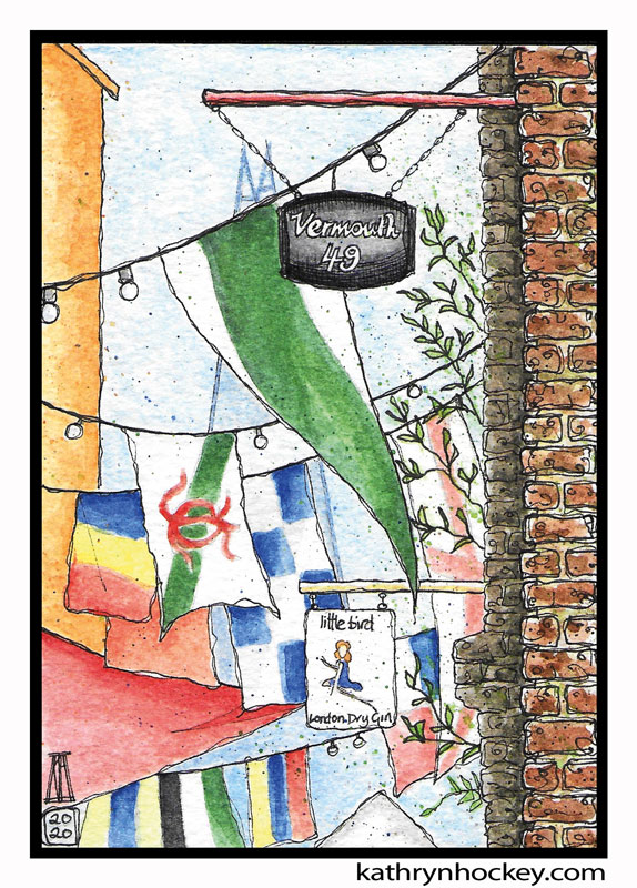
Maltby Street food market which ran on weekends before lockdown and is actually in Rope Walk.
A Ropewalk was historically a long, straight, narrow piece of land set back from a river where rope manufacturers could lay out and twist the constituent strands of the rope. They were inevitably disrupted by construction. This Rope Walk in Bermondsey was chopped up in 1836 by seven of the nineteen railway arches supporting the London to Greenwich railway line – the longest run of arches in Britain to this day. These arches are now home to bars (including Little Bird Gin and Vermouth 49 whose signs you can see in the painting), restaurants and a timber yard. Before Corona the regular and guest traders would set up street food stalls and if we didn’t get there early we’d be jostling with friendly flocks of weekend brunch and lunch seekers.
The upmarket reclamation yard Lassco is also housed in one of the railway arches. It’s an eclectic boutique of gorgeously designed and tastefully battered old treasures which have been lovingly removed from their previous homes. I love to visit with a fellow sketching friend for a couple of hours of drawing and eavesdropping, after enjoying a coffee and a breakfast pastry from the Comptoir Gourmand bakery a few arches down. You’ll remember, perhaps, that we salivated outside the Comptoir Gourmand window while we meandered up Bermondsey Street and that I promised to point out the source of those baked delights. The lovely Lassco folks always make us welcome, even though we’re taking up space and not buying anything.
I made the original version of the painting above on site in Rope Walk at the end of January 2020. Ooh, there was a bitter little wind that day but the welcome from Bar Tozino, whose outside table I sketched at, was warm. Here’s a link to my original Rope Walk sketch blog.
The Rope Walk railway arches, accessed on the other side of the railway line from Druid Street, also mark the official start of the unofficial ‘Bermondsey Beer Mile’ which is an ever changing string of independent breweries – some produce cider – actually stretching more like two miles to the south east. We’re going to look at another section of railway arches now.
Spa Road railway station opened in 1836 and was the first ever railway station in London. It sat on the line which ran from London Bridge to Greenwich and was so basic that they initially described it as a ‘stopping place’ rather than a station. When London Bridge station opened a few months afterwards fewer people used the Spa Road stop and by 1838 it had been boarded up. Here’s an engraving of the viaduct in 1836.
The station was reopened in 1842, underwent several upgrades, was relocated by a couple of hundred metres and then renamed before it was closed permanently in 1915.
During its heyday Spa Road station facilitated the huge influx of hard workers necessary to keep Bermondsey’s extensive industry going from the mid-19th century to the early 20th century. The closest rail link to this spot is Bermondsey Tube; five minutes walk away on Jamaica Road it opened in 1999 and links with the London Underground via the Jubilee Line.
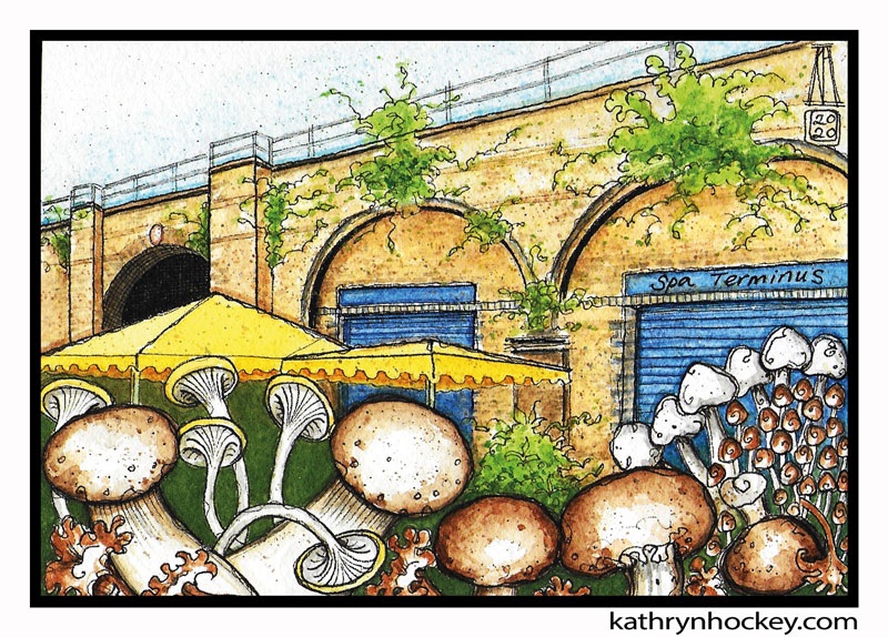
Nowadays the railway arches supporting the track around Spa Road are inhabited by artisan food and drink producers under the Spa Terminus umbrella and Bermondsey has finally regained its ‘London’s Larder’ status. Saturday morning is the main trading time (some traders open more often even in these lockdown times) for the highest quality meat, cheese, bread, beer, wine, cider, honey, coffee and cakes as well as preserves and flowers. My favourite trader is Puntarelle & Co. who stock the most beautiful seasonal fruit and veg I’ve ever seen. In January I bought the gorgeous mushrooms that appear in the painting. They turned out to be delicious baked with oil, salt and pepper and served on toasted sourdough bread from The Little Bread Peddlar, which trades from another arch. You can see the original sketch I made of the mushrooms here.
My flat is in a quiet square just off Spa Road; when I moved in there was a grubby fish and chip shop, a tiny grocery store with no fresh produce and a dodgy pub. Gentrification gets a bad rap but there are definitely some interesting, life-enhancing and inspiring effects.
We’re now going to walk west along Spa Road; if we keep an eye out to the right we’ll see Neckinger which looks like an ordinary road, but in fact started out as a river. In the middle ages you could get from the River Thames to Bermondsey Abbey by taking a boat along River Neckinger and the Abbey made good use of its tidal flow to power a mill. After the Abbey was dissolved by Henry 8th in 1537 the mill ended up in private hands and about 200 years later the mill’s monopolisation of the tidal water was challenged by the leather tanners who were moving into the area. Creepily, Neckinger is thought to derive its name from ‘devil’s neck cloth’ – a slang term for the hangman’s noose – because in the 17th century convicted pirates were hanged at the wharf where River Neckinger meets the Thames – a place called Jacob’s Island. Starting in 1837 Charles Dickens published, in installments, his now world famous novel ‘Oliver Twist’. Dickens, appalled and inspired by the horrendous and notorious squalor of Jacob’s Island named a branch of River Neckinger ‘Folly Ditch’ and killed off the villainous Bill Sikes there. This is how he described Jacob’s Island:
“. . . crazy wooden galleries common to the backs of half a dozen houses, with holes from which to look upon the slime beneath; windows, broken and patched, with poles thrust out, on which to dry the linen that is never there; rooms so small, so filthy, so confined, that the air would seem to be too tainted even for the dirt and squalor which they shelter; wooden chambers thrusting themselves out above the mud and threatening to fall into it – as some have done; dirt-besmeared walls and decaying foundations, every repulsive lineament of poverty, every loathsome indication of filth, rot, and garbage: all these ornament the banks of Jacob’s Island.”
And in 1849 The Morning Chronicle described Jacob’s Island thus:
“The very capital of cholera” and
“The Venice of drains”.
In the 18th century a spring from the River Neckinger (which now runs underground) was discovered and the area between Grange Road and Jamaica Road was developed as Bermondsey Spa, hence the name Spa Road.
Spa Gardens (originally called Spa Park) which features in the next painting, was part of that development. You can see an 18th century engraving of the design for the gardens here made by the artist Thomas Keyse.
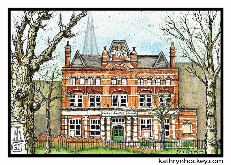
For me, this was one of the most beautiful and surprising neighbourhood transformations. This building, with its uplifting stripes and symmetry, housed the library between 1891 and 1989 and became a Buddhist Meditation centre in 1998. The centre contains a cafe, a book and gift shop and two delightfully tranquil shrine rooms which, before lockdown, were open for private contemplation, teaching and group meditation sessions.
There’s the Shard again in the background.
We’re going to Grange Road now, to have a look at a very elegant building…so we’ll bear left and take the short walk through Spa Gardens.
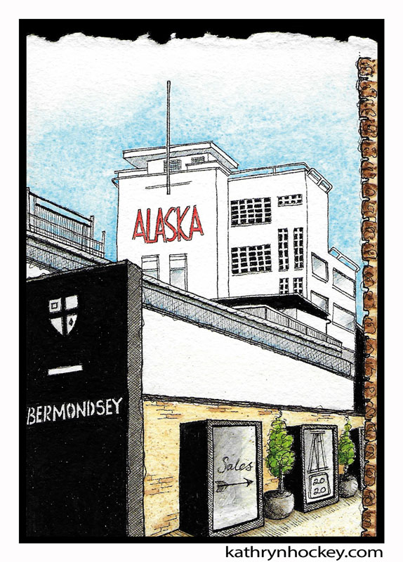
The white art deco Alaska Factory was designed by Wallis, Gilbert and Partners and built in 1932. It’s amazing that it’s still standing – it survived an electrical fire in 1940 and escaped the World War 2 Blitz when a bomb dropped into the grounds failed to explode.
The original factory was built in 1869 by F.A. Schroeter but only the stone gateway (depicting a seal) still stands. C.W.Martin & Sons Ltd bought the site in 1873 and owned it for about a hundred years. Gruesomely Martins specialised in fur, mostly seal fur, which came from the Antarctic, Canada and Alaska and was very fashionable in Victorian times. Martins also went on to make fur lined flying suits for the Royal Air Force. The firm left Bermondsey in the 1950s after which the building was heavily restored and converted to apartments. This photo taken in 1978 shows the red sign when it still said ‘Martins’. Having a full tour of the Alaska Factory interior is definitely on my wish-list.
While we’re on Grange Road (named ‘The Kings Road’ in this map form 1787) I’m going to write a note about Bermondsey’s Municipal Bath House. It was built here in 1927 as part of a drive towards better health for residents, led by the wonderful Alfred and Ada Salter who were also devoted to slum clearance and tree planting. People could swim, take a bath in private, use steam rooms and wash and dry their laundry. It also became a rather popular gay hangout; the genius comedian and actor Kenneth Williams went there in the 50s and found it “quite fabulous”. The huge and apparently sumptuous bath house was in operation until 1973 when structural defects led to it being demolished in 1975. What a shame they tore it down!
In 2014 the social commentator and street art stencil master Banksy reportedly painted a piece of street art on a wall in Grange Walk, visible from Grange Road. It disappeared in 2016, when it was suggested that the owner of the building had cut it out in order to sell it.
Now we’re going to double back to the corner of Grange Road and Spa Gardens to wait for the number 1 bus which will take us down ‘The Blue’. We could get there on foot in 15 minutes or catch the number 78 bus but who could resist a ride on the number 1?!
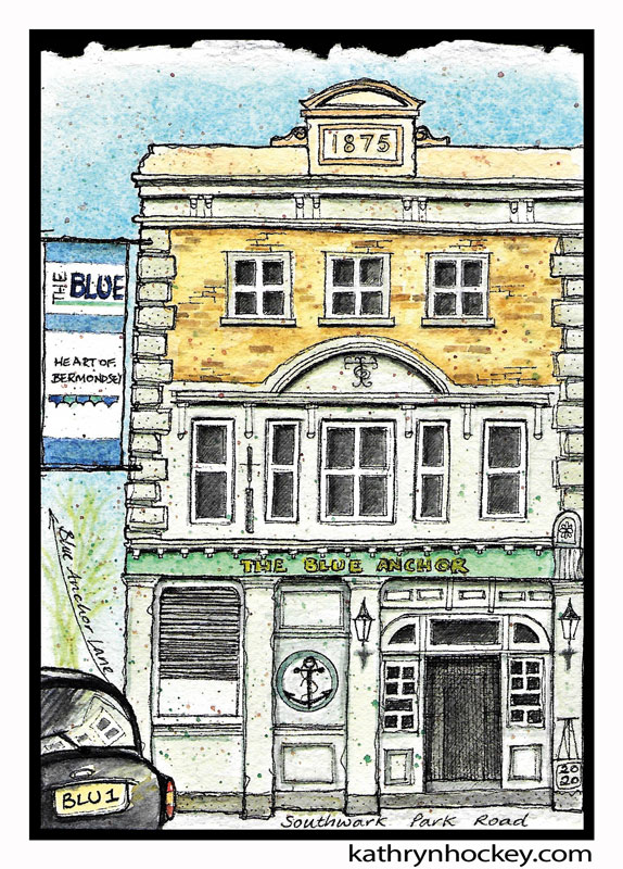
The Blue is loosely defined as the area within a five minute walking radius from the Southwark Park Road market place which has been present since the 11th century but was last overhauled in 1976.
I’ve chosen The Blue Anchor pub to represent The Blue because it’s the most attractive building down there. Don’t get me wrong – I enjoy visiting the library and there’s superb fresh produce available to buy there but The Blue doesn’t offer the same visual treats as Bermondsey Street but a community led regeneration project called Made In Bermondsey is underway.
Bermondsey was a major target for the Nazi Luftwaffe during the Blitz of World War 2 because it was a hub of industrial activity. 400 civilians died and many homes and factories in the Borough of Southwark were destroyed by the 1651 bombs and 20 parachute mines that were dropped there during the 8 months following September 7, 1940. It’s verging on the miraculous that so many of Bermondsey’s older buildings survived at all and not surprising that people left in droves during and after the war. In 1901 there were 131,000 residents but that number had more than halfed to 61,000 by 1959.
Back to the pub in the painting above. According to insurance records there was a pub on this spot from 1789, and as we can see from the stone carving on the roof, The Blue Anchor was rebuilt in its present form in 1875. It sits on the corner of Blue Anchor Lane and Southwark Park Road and according to this map dated 1787 Southwark Park Road was then known as Blue Anchor Road, a name which has great religious significance – hardly surprising since the land was owned by Bermondsey Abbey for about five hundred years.
Blue (also, historically, ‘Blew’) is the colour considered to denote spiritual purity, faith, to represent heaven and to keep bad spirits away. In the middle ages (5th-15th century) Anchorites were devoutly religious people who withdrew from their communities to live in small stone cells called anchorholds which were usually attached to village churches. They spent their lives in solitary prayer and contemplation and some of them were even bricked into their cells; their basic needs being met via tiny windows. Huge numbers of pilgrims would have passed this way to visit Bermondsey Abbey and they would have sought solace from their arduous journey in the presence of the Blue Anchorholds.
This photo, taken in 1928 shows wood clad cottages in Blue Anchor Lane, which in 1812 had become the location of the world’s first food canning business, a process invented by Donkin, Hall and Gamble. Here’s a photo of one of their early tinned iron containers.
We’re popping around the corner now to find out why Bermondsey was once called ‘Biscuit Town’.
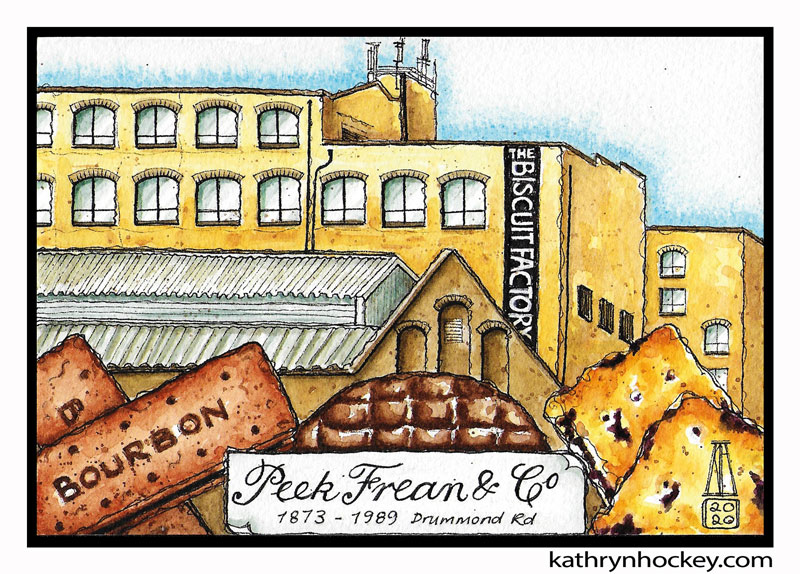
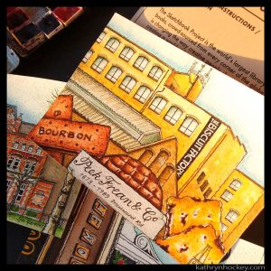
Mr Peek Senior was a big wig in the tea import business but his two sons weren’t interested in tea so he persuaded them to set up a complimentary business. And what goes better with tea than biscuits? (OK, cake is a contender, but for the sake of this piece we’re starting with biscuits). The Peek boys eventually dropped out of the biscuit business too so Mr Peek’s niece and her husband Mr Frean joined in – and thence was born Peek Frean & Co. Shortened to Peek Freans in the 1970s, it was a household name when I was a kid. I grew up on three of their most famous biscuits which I depicted in the painting above with the Drummond Road factory in the background. Left to right I offer you: the Bourbon – the prototype was released in 1910 under the name ‘Creola’; the first ever chocolate digestive, marketed as the ‘chocolate table’ in 1899; and the Garibaldi – invented in 1861 by Jonathan Carr of the famous Scottish biscuit family who was recruited to Peek Freans shortly beforehand. We used to call Garibaldis ‘dead fly biscuits’ because the squashed raisins showing through the biscuit crust bear more than a passing resemblance to swatted insects, but that didn’t put us off – they’re really tasty.
The business was first registered in 1857 when it moved into a ex-sugar refinery on Dockhead, also in Bermondsey, near the River Thames. It outgrew those premises (which burnt down in 1873) and moved to a 10 acre site between Drummond Road and Clements Road. For many years afterwards Bermondsey was known as Biscuit Town (to be clear: a UK biscuit is the equivalent of a US cookie) and smelt sweetly of baking butter, sugar and flour – a marked improvement from the tanning years.
This is an extract of one of the first documentary films ever made -it shows biscuit production at the Peek Freans factory in 1906. Some of the workers were just kids.
The film was made to publicise the company’s expansion into cake baking; they went on to gift wedding cakes to Queen Elizabeth 2 and provide one of the 27 (yes, really) wedding cakes for the ill fated nuptuals of Charles and Di.
In 1929 the Twiglet, the iconic savioury snack that looks like a knobbly twig and tastes of Marmite, was invented by the French biscuit baker Monsieur J. Rondalin. A great gift to the world.
The Biscuit Factory closed in 1989 and stood empty and derelict for many years. Following extensive renovation it’s now run as a business hub with offices, workshops and studios for rent.
As well as earning the nickname ‘Biscuit Town’ Bermondsey was also dubbed ‘London’s Larder’ because it hosted the factories of many household names: Crosse and Blackwell, Pearce & Duff, Shuttleworth’s chocolate, Sarson’s vinegar, Hartley’s jam and Courage beer.
We’ll hop on the number 1 bus again now, head southeast and get off near South Bermondsey railway station…
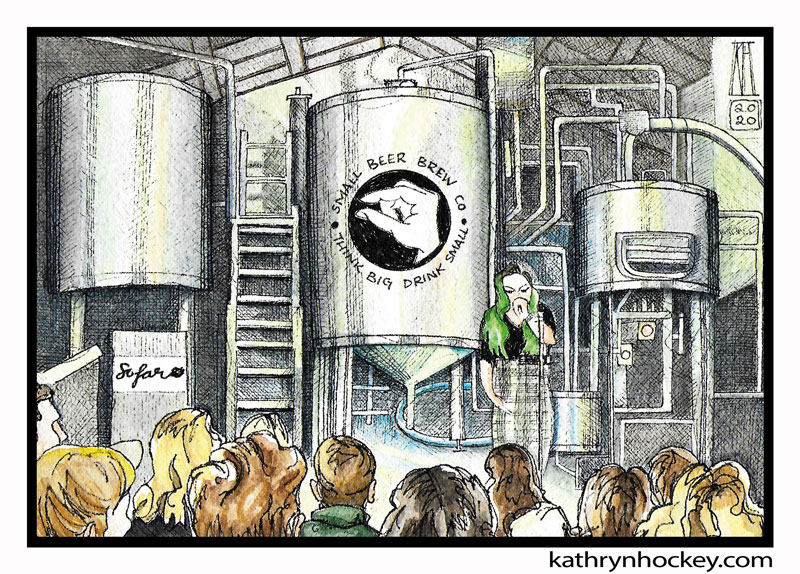
A short walk from South Bermondsey railway station we find the independent and progressive Small Beer Brew Company which is dedicated to the production of vegan beer. They’ve developed a method which uses much less water than standard brewing techniques to make their low alcohol range with a nod to the 17th century. This is how they describe it:
“In a world where drinking water could be fatal, small beer was enjoyed in households, workplaces and even schools across the country for its hydrating and nutritional properties. A staple of British daily life in the 1700’s, it was traditionally always brewed between 0.5 – 2.8% ABV.
With the provision of clean drinking water in the 19th century, the requirement for small beer passed and the art of its creation was lost.
At the Small Beer Brew Co. we specialise solely in the production of this historic beer style so rich in history!”
I went to the brewery in March for a live music gig, the last I saw before lockdown. It was organised by Sofar Sounds who put on intimate gigs in unusual places all over the world. When you buy Sofar Sounds tickets you don’t find out the exact address of the venue until 24 hours before the show and you don’t find out who’s going to perform until you get to the venue. Nice surprises!
I had a great time: the atmosphere was relaxed and friendly; the small crowd sat on low benches or rugs on the floor, snacking on food they’d brought with them and enjoying the excellent music and the small beer (I can’t review the beer as I’ve been alcohol free since January). The Bloom Twins kicked off with their ‘dark pop’, followed by Mae Monypenny‘s beautful and haunting looped vocals – she’s the one with the green hair in the painting – and lastly the exuberant soul band Zebede.
Process
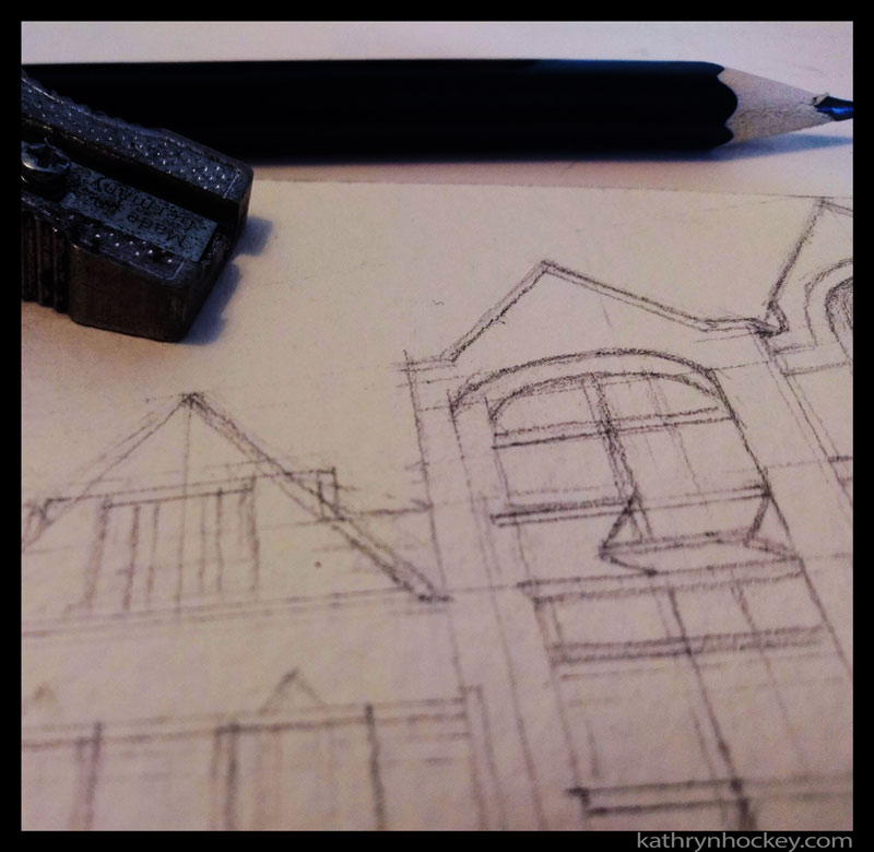
Ideally I would have done all the sketches on site in the street but working from my own photographs is a good substitute.
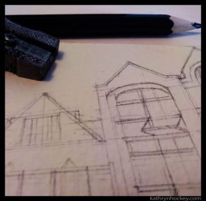
I always start with a pencil drawing so that I can get the proportions and perspective right.
Then I ink in the drawing with water resistant pen.
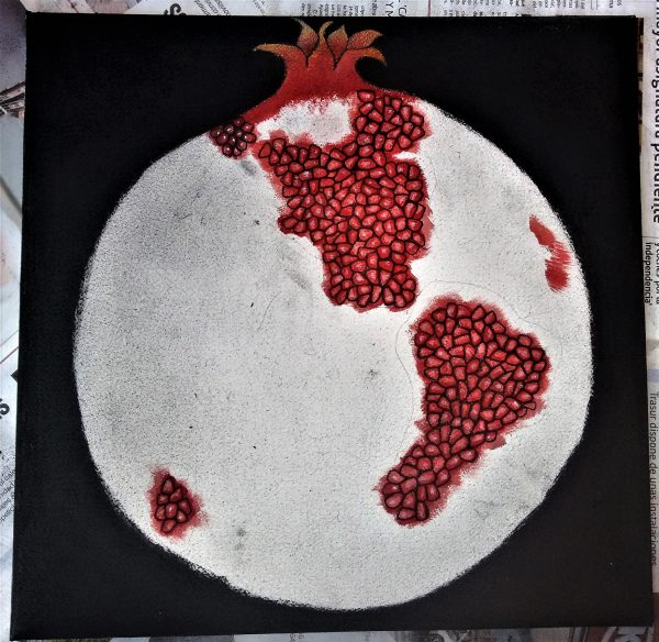
Before adding layers of watercolour paint which works better on heavier paper which is why I didn’t paint the snapshots directly into the sketchbook.

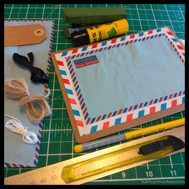
I collaged airmail envelopes and luggage labels onto the covers of my sketchbook to ready it for its journey
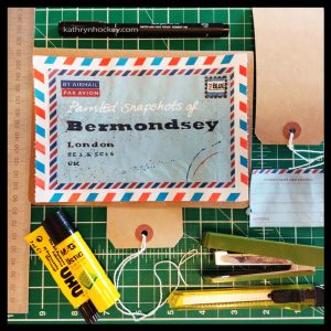
and then added the hand drawn text.
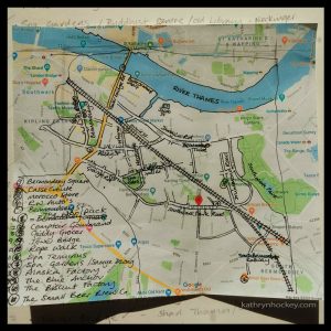
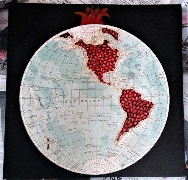
To make my map I started by marking out the loactions I wanted to include on a printout of a google map.
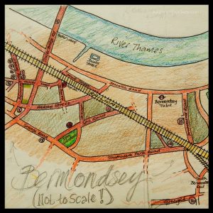
I drew a rough version to the correct size
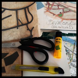
and then, while looking through a selection of old papers I decided to collage the map rather than draw it.
December 2020 update
I published a printed version of my artist book; all proceeds from sales were donated to Southwark foodbank.
The print run was limited to 50 copies which I numbered and signed and each book came with a randomly selected postcard from the snapshots series.
References:
https://en.wikipedia.org/wiki/Bermondsey
https://www.stylist.co.uk/life/best-places-live-london-revealed/196218
https://www.businessinsider.com/sunday-times-best-places-to-live-bermondsey-best-in-london-for-2018-2018-3?r=US&IR=T
History
History of Bermondsey Abbey
http://www.shermanandwaterman.co.uk/bermondsey-antique-market-a-complete-history/
https://www.london-se1.co.uk/
In Old Bermondsey
The car repair shop with horses heads
https://collage.cityoflondon.gov.uk/home
http://www.secret-london.co.uk/Bermondsey_2.html


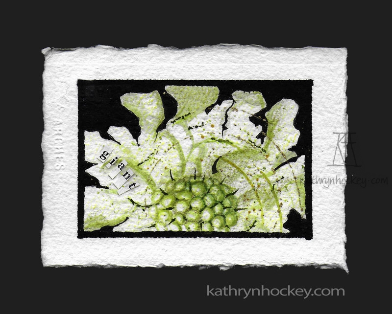
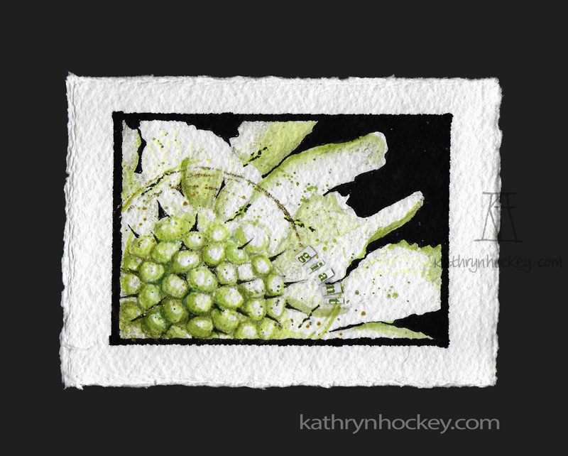
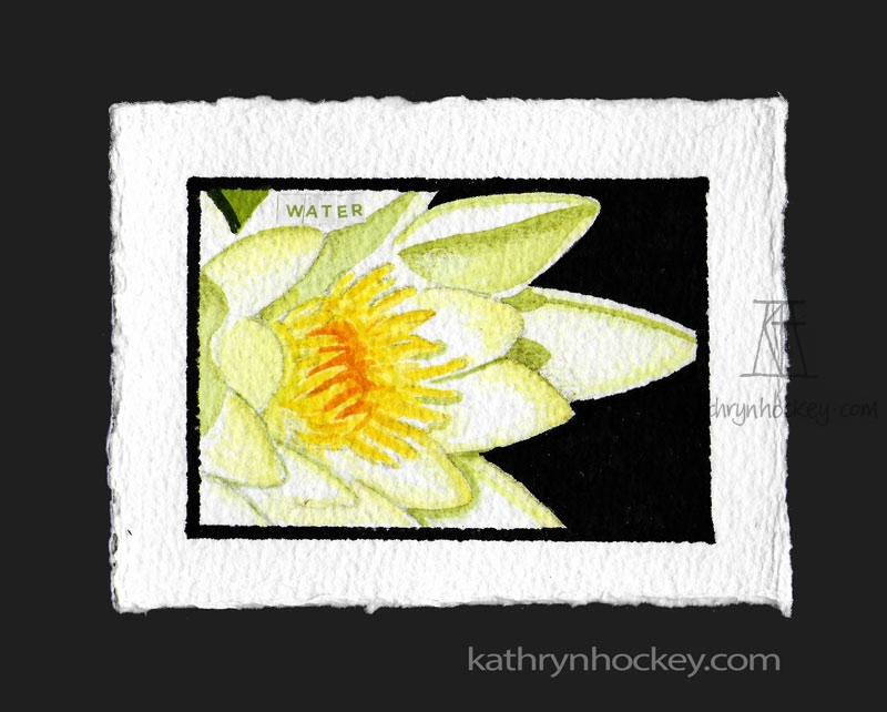
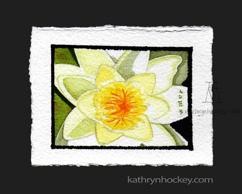


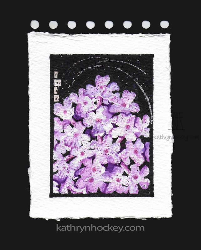
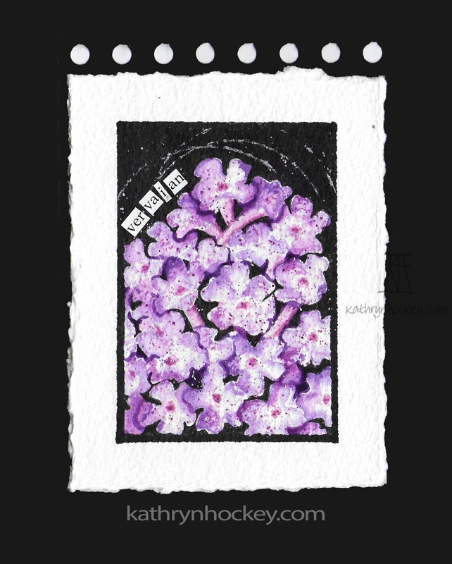
 And then I painted three versions of the verbena / vervain:
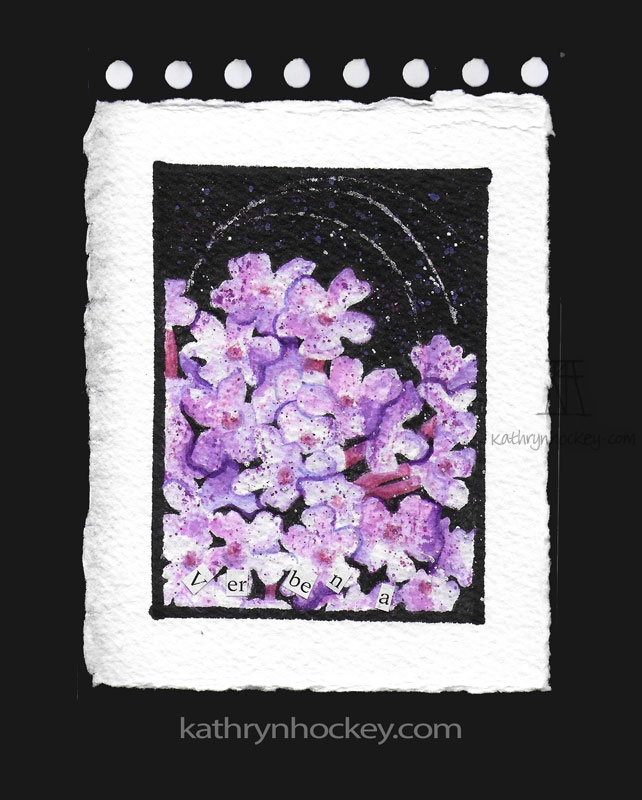


 Free Space Gallery