Food, Glorious Food

I love food!

I love thinking about what I’m going to eat. I love looking at food; in shop windows – especially cake shops – but also on Instagram and the telly. Eating it is my absolute favourite thing (expanding middle years waistline attests to that) and painting food was, for a while, an irresistible urge. It’s like the super slow version of an Insta lunch snap.

I’ve collected my best watercolour food paintings and posted them here as a sort of portfolio. Some are simple representations of pretty edibles and others have more of a narrative. Some were quick sketches done on the spot while for others I worked more slowly from photos I took before eating the subject. 

These food illustrations also form a  travel journal of sorts so I’ve divided them by region – London, West Bengal, Cape Verde and Andalusia – and put them in loose reverse chronological order. 

London

These first two illustrations are from my ‘Painted Snapshots of Bermondsey’ project, which aims to take the reader on a guided stroll through the streets of Bermondsey to see some of my favourite places.

illustration, brooklyn art library, the sketchbook project, sketchbook, pen and wash, watercolour, watercolor, painting, drawing, urban landscape, urban sketching, corona virus lockdown 2020, bermondsey, london, se1, se16, independent trader, bermondsey street, comptoir gourmand, patisserie, cake, shop, bakery, food illustration, food, fruit,tart, boulangerie

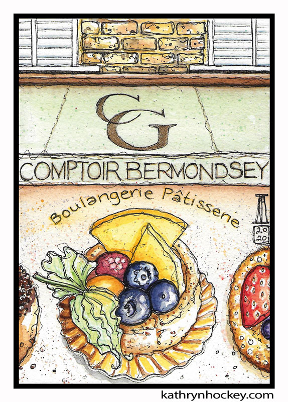
As I said in the intro, cake shop windows are a magnet for me; Comptoir Gourmand have a stunner.

illustration, brooklyn art library, the sketchbook project, sketchbook, pen and wash, watercolour, watercolor, painting, drawing, urban landscape, urban sketching, corona virus lockdown 2020, bermondsey, london, se1, se16,, casse croute, independent trader, bermondsey street, food illustration, restaurant, french food, wine, table, risotto, french cuisine, street sign

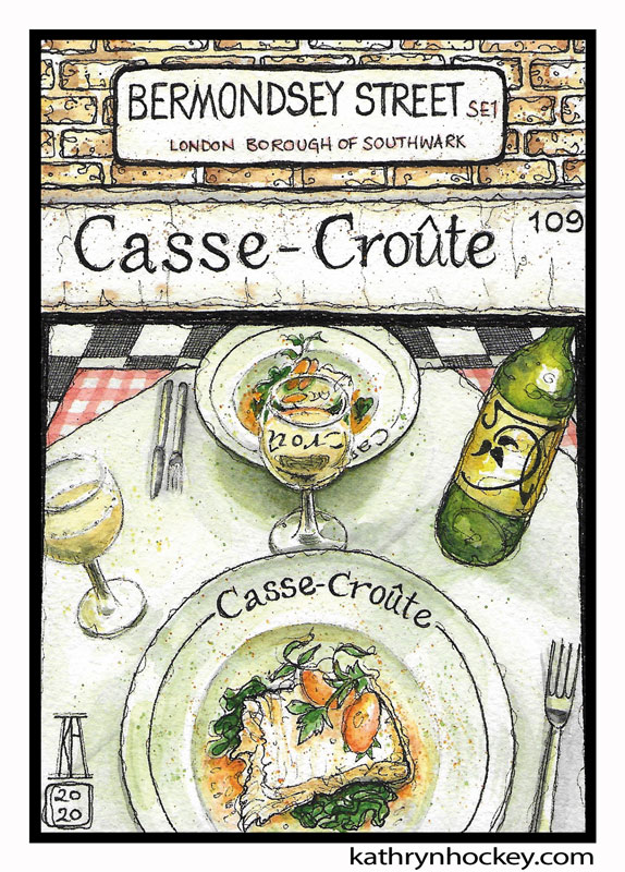
I had admired the view through the window of Casse Croûte many times before I ate there. Its double checked interior promised cosy continental conviviality amid steaming plates of deliciousness; the lure being greatest on dark, chilly nights. And it lived up to expectations in every way.

afternoon tea, goring hotel, cream tea, cakes, scones, jam, clotted cream, sandwiches, tea, tea pot, watercolour, painting, sketchbook art, sketchbook, food illustration, pen and wash, watercolor, drawing, sketching, london, tea strainer

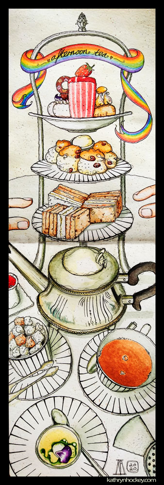
The combination of the cake stand loaded with colourful, tasty morsels; the striped crockery and the reflective tea pots in the late winter sunshine was quite spectacular. Smitten, I took some photos in preparation for future painting sessions. Then I tucked right in. Afternoon tea at The Goring Hotel – a lovely way to celebrate a birthday with special friends.

Click here to see my original Afternoon Tea post.

yen burger, london, burger, chips, fries, stripes, watercolour, watercolor, painting, drawing, sketch, sketchbook, food, food illustration, illustration, pen and wash

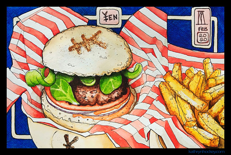
As soon as I saw this Yen Burger nestled in its little bamboo steamer lined with festive stripy paper my painter’s urge was tweaked. I was on my way to an appointment with no time to paint on the spot so I took a few quick snaps for reference and tucked right in. Yummy Japanese take on the fast food classic. 

Click here to see my original Yen Burger post.

mushrooms, watercolor, puntarelle, bermondsey, london, watercolour, painting, sketchbook, pen and wash, food illustration, illustration, drawing, paint it then eat it

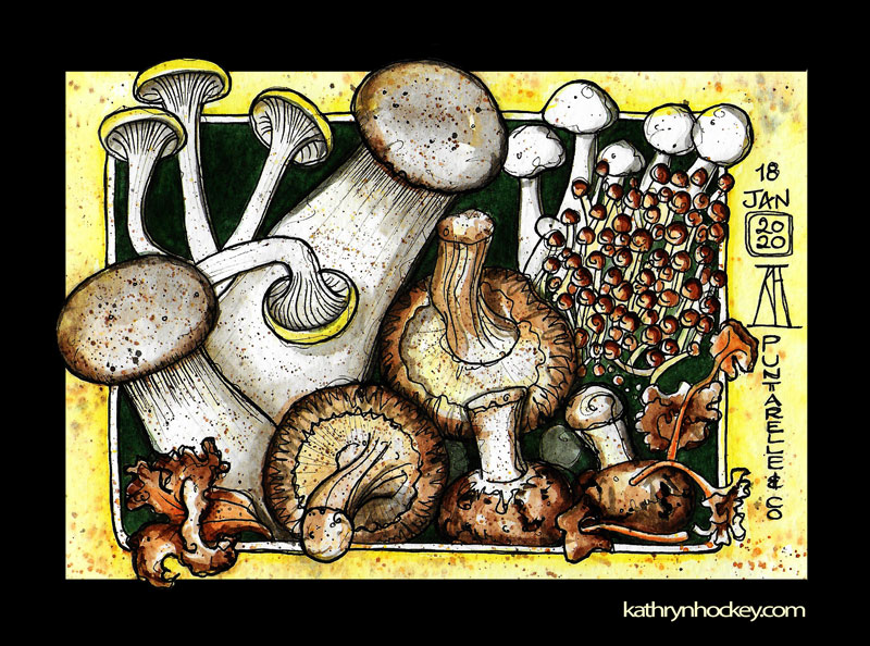
These gorgeous mushrooms are from the Puntarelle & Co Saturday morning fruit and veg market under the Spa Road railway arches. All their produce is lush and carefully laid out in traditional wooden boxes – the antithesis of supermarket shopping. The fungi had a certain sinister drama about them and proved to be delicious.

Click here to see my original Mushrooms post.

Too Good To Go:

Returning to London after a long absence gave me a ‘kid in a sweet shop’ feeling. All those cultural and culinary delights on offer. But the foodie indulgence comes at more than a calorific price.

A friend told me about the Too Good To Go app. It lets you know which local outlets are offering discounts on good food which would otherwise be thrown away at the end of a shift.

It perfectly combines my ‘thinking about what I’m going to eat’ and ‘looking at food’ loves with the bonuses of getting delicious food at bargain prices and combating food waste.

There’s also the surprise element; you’re not sure what you’ll get in your magic bag of rescued goodies until you pitch up at collection time with your online receipt.

These next three are all ‘paint it then eat it’ exercises of Too Good To Go swag.

lolas cup cakes, cup cakes, cake, watercolor, too good to go, fight food waste, watercolour, painting, sketchbook, pen and wash, food illustration, illustration, drawing

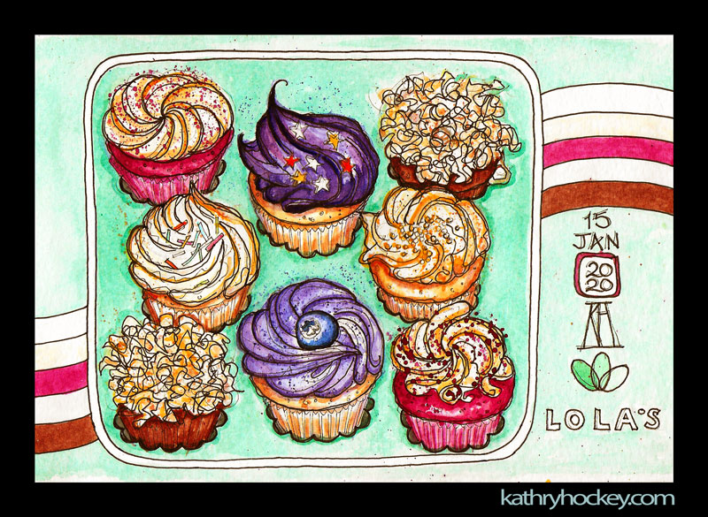
Lola’s cupcakes…mmm…yes, I shared them, they were mini but mighty at the same time. Pretty, cheap and exceptionally tasty!

Click here to see my original Cupcake post.

sushi, sushi shop, healthy eating, too good to go, fight food waste, watercolour, painting, sketchbook, pen and wash, food illustration, illustration, drawing

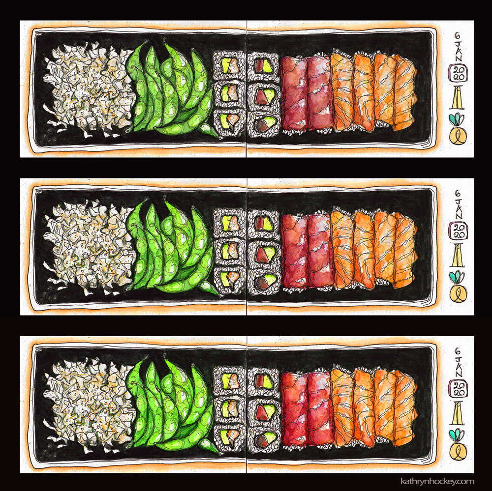
Sushi Shop …well sushi is a work of art in every sense. The high fish and soy content of Japanese food also makes regular eaters less likely to suffer from some classic menopause symptoms. What’s not to like? My rescued sushi was actually one box (at less than half the retail price) but I liked the way it looked as a triptych and it made for an Insta friendly square image.

Click here to see my original Sushi post.

cake, konditor, too good to go, fight food waste, red velvet, chocolate, watercolour, painting, sketchbook, pen and wash, food illustration, illustration, drawing

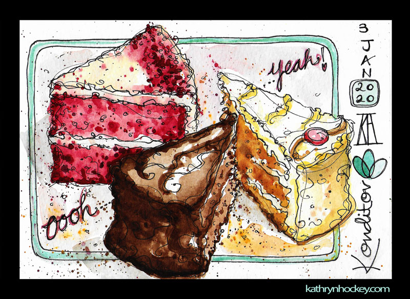
At the end of the last century I worked for a few months at the Konditor branch near Borough Market. I knew from that experience that the magic bag (box in reality) contents would be divine. Inspired by the promise of eating I worked really fast when I painted these fat wedges of carrot, red velvet and chocolate cake – which I did share with my flatmates.

Click here to see my original Cake post.

West Bengal 

I was lucky enough to spend six months traveling in India. It was an amazing experience and a huge culture shock.

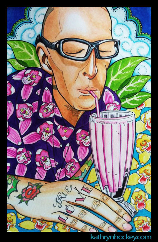
In West Bengal the atmosphere tended to be cooler and calmer and the food was fabulous.
banana, banana split, banana plant, ice-cream, watercolour, watercolor, pen and wash, watercolour portrait, portrait, painting, drawing, sketchbook, food illustration, illustration, travel blog, travel illustration

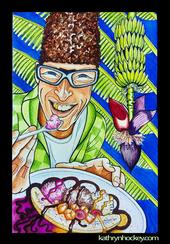
A banana split is not an inherently Indian dish, but to eat one in close proximity to actual banana trees is an exotic experience. I tried to capture my travel companion’s ‘joy through dessert’ moment in this portrait cum food cum botanical illustration.

portrait, watercolor, painting, drawing, sketchbook, food illustration, travel blog, illustration, watercolour, pen and wash, tattoos, tattooed man, true love, lassi, orchids, flowers, leaves, glasses, bald head, clouds, pink drink

Here I’ve used the repeated orchid motif to represent the horticulture of Kalimpong and the background is inspired by the glorious decoration in the many Buddhist Monasteries there.

thali, watercolor, watercolour, painting, pen and wash, drawing, sketchbook, travel blog, illustration, food illustration, darjeeling, west bengal, dal fry, papad, saag paneer, spinach, cottage cheese, eggplant fritters, beguni, patta gobhi sabji, sabji, aloo sabji, homestay, little singamari, eat like a local, indian food, vegetarian food, home cooking

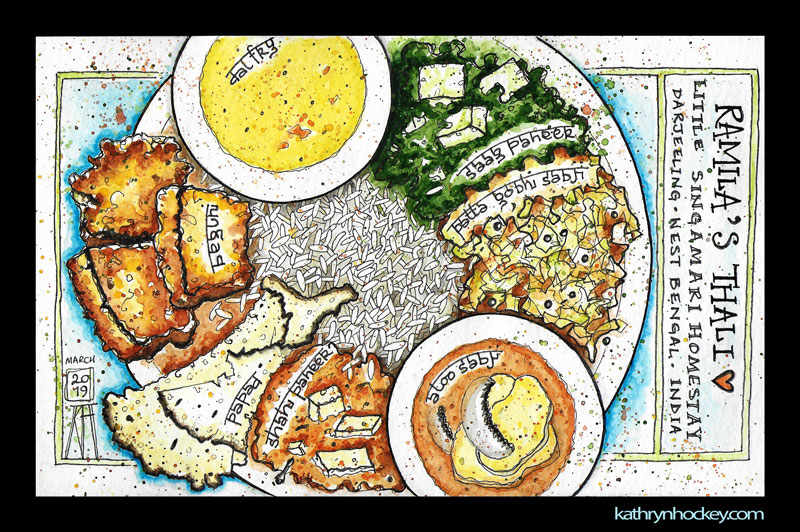
We boarded in a few home-stays where we were fed delectable, hearty and healthy home-cooked meals several times a day for very little money. We could really taste the love in this food – it was phenomenally satisfying.

puri sabji, indian food, indian breakfast, vegetarian food, aloo gobi matar, potato, cauliflower, peas, watercolour, watercolor, painting, drawing, sketchbook, food illustration, travel blog, travel illustration, eat like a local, food art, watercolour food, pen and wash

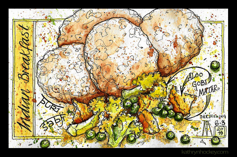
Darjeeling was bitterly cold and very damp for our first few days which made venturing outside quite an undertaking. Since I caught a cold as soon as we arrived I was happy to spend hours in front of the heater inside paying pen and watercolour homage to the culinary delights we were experiencing.

kunga restaurant darjeeling, tibetan food, wanton soup, momo, vegetarian food, vegetable spring roll, steamed momo, watercolor, watercolour, painting, drawing, sketchbook, food illustration, travel blog, travel illustration, watercolour food

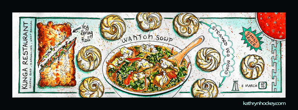
When we did go out there was usually a visit to Kunga Restaurant involved. My interest in the wanton soup was verging on the hysterical. Momo (small steamed dumplings filled with chicken or vegetables) were ubiquitous in West Bengal and Sikkim – that made me very happy.

Click here to see my original West Bengal post.

Cape Verde

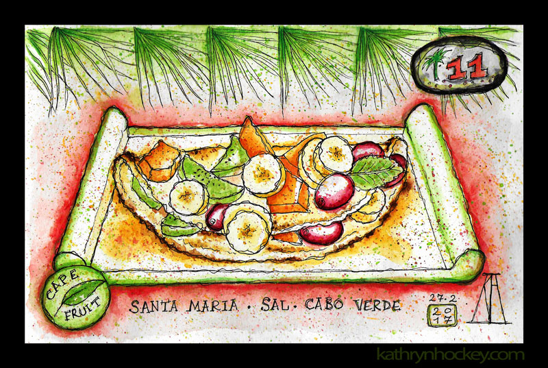
In 2017 I went to see a friend in Cape Verde. She was staying on Sal, the most touristic and least beautiful and interesting of the islands I visited. 

cape fruit, santa maria, sal, cape verde, cabo verde, breakfast, brunch, lunch, smoothies, natural bar, fresh fruit, healthy eating, smoothie, banana, strawberry, coconut, pen and watercolour, sketch, food, illustration, vegan

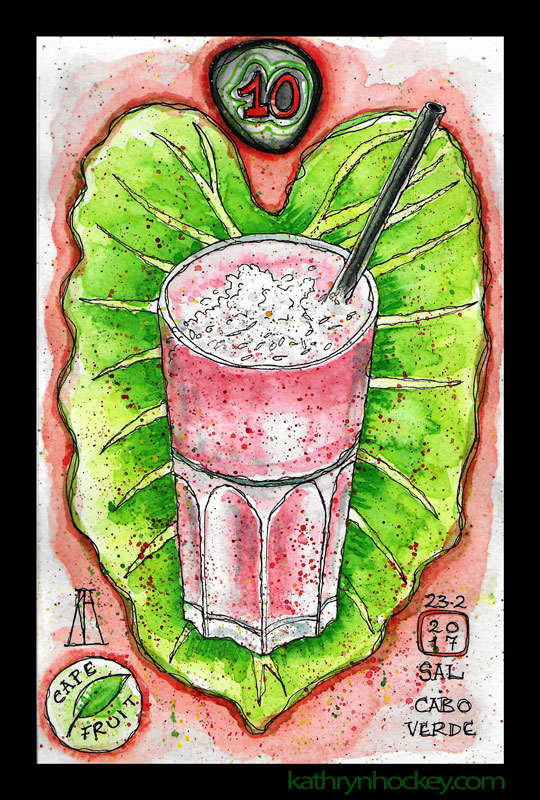
Cape Fruit restaurant was a great consolation – a beautiful oasis of rustic charm where an expert team of local women made and served healthy, tasty food and drinks. What a joy to order something lovely, paint it at leisure while sitting in the shade and then eat it.

cape fruit, santa maria, sal, cape verde, cabo verde, breakfast, brunch, lunch, smoothies, natural bar, fresh fruit, healthy eating, pancake, banana, grape, papaya, kiwi fruit, honey, water color. pen and watercolour, sketch, food, illustration, vegan

Click here to see my original Cape Verde blog.

Andalusia

At the end of 2014 I was invited to join the Vejer Sketchers, a small but enthusiastic group of artists who met on Saturday mornings in the southern Spanish town where I’d been living for a while. So that following year I finally undertook the regular sketch practice I’d been intending to start for ages.

There can be a ‘safety in numbers’ aspect to ‘urban sketching’ in a group. OK, so you still look like weirdos but you’re a band of weirdos and the inevitable attention of passersby is divided and therefore less intimidating. 

Sometimes we joined or were joined by groups of sketchers from other towns, like Cadiz and Jerez. There is always something new to learn from the methods and materials of other practitioners, and their passion for their craft is infectious. I also found that working in a sketchbook freed me up. There was no way I was going to tear a sheet out of that book so the paintings were for just for me. With no pressure to paint something saleable I started to draw and paint in a quicker, rougher, looser way than before, which made it more fun and more relaxing.

I didn’t often paint food with the group but I did apply my new, looser skills to my depictions of food.

green tea, té verde, book cover, portada, play, comedy, tragicomedy, marcel snyders, playwright, hospice, mother, daughter, illustration, cover design, art, drawing, watercolour, watercolor, acuarela, painting, pintura, ilustración, tea bag, cup, saucer

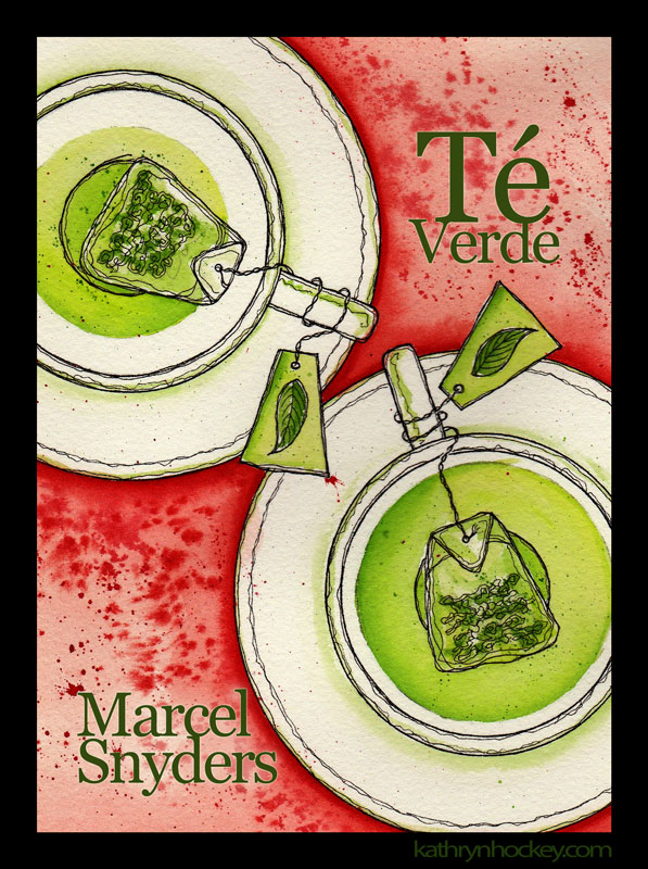
Marcel commissioned me to paint the cover for his play “Green Tea” (Té Verde) in the sketchy style he liked. He stipulated this complimentary colour combination and left the rest to me. There’s a sinister aspect to the play which is why some of those red splatters look like blood.

Click here to see my original Te Verde blog.

pen, watercolour, water color, drawing, painting, illustration, food, map, andalucia, andalusia, annie b, spanish kitchen, vejer, cadiz, jerez, sherry, cerdo iberico, queso de cabra, goats cheese, iberian pork, retinto, beef, tuna, atun, octopus, pulpo, flamenco, squid, calamari, lemon, limon, anchovies, anchoas, prawns, gambas, atlantic ocean, oceano atlantico, mediterranean sea, mar mediterraneo, solera, spices, vineyard, bodega, chorizo, olive oil, acete de oliva

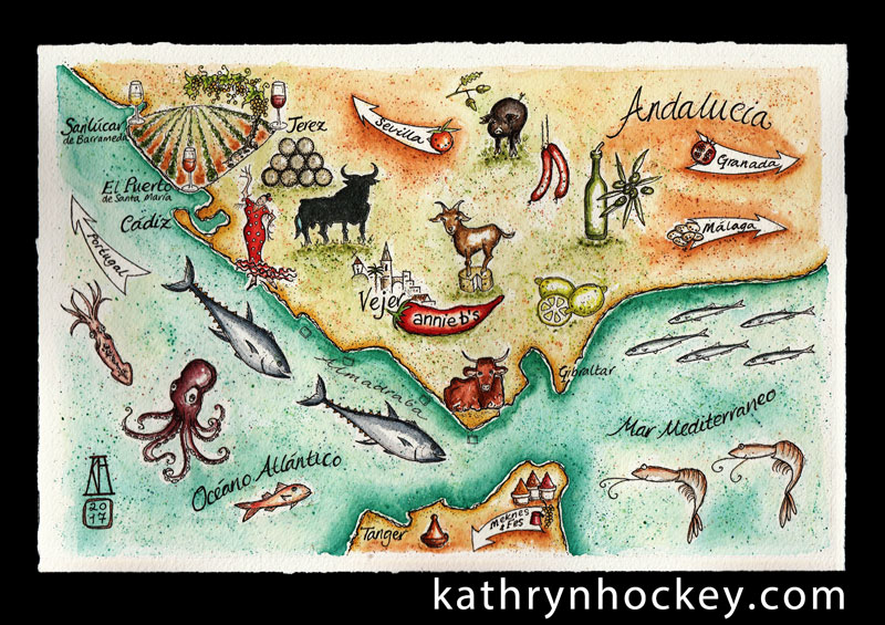
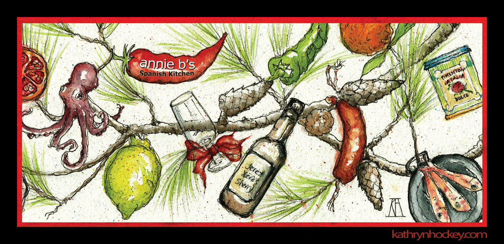
Annie B is a force of good nature; her food and wine tours and cooking courses are ranked amongst the best on offer in Spain. I was delighted to complete these two commissions from her: to create an Andalusian food and drink map (above) and a food and drink themed Christmas card (below).

annie b, spanish kitchen, spanish cooking, andalucia, cooking courses, sherry, jerez, xerez, tours, lemon, pomegrante, orange, peppers, salmonete, red snapper, mussel, octopus, pulpo, pine, christmas, card, chorizo, pimenton, paprika, sketch, watercolour, pen and watercolour, pine cones, umbrella pine, paella pan, card, christmas card, drawing

Click here to see my original Food Map blog.

Click here to see my original Christmas Card blog.

One of the best aspects of living in a small rural town in southern Spain is the seasonality of the fruit and veg.The seasons for local produce may be very short but the produce itself is perfect while it’s in the green grocer’s.

asparagus, esparrago, spring, vegetables, pen and watercolour, watercolour, water color, acuarela, sketch, food, illustration

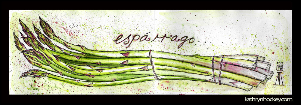
The subtle combination of mauve and green on these tender asparagus stems was utterly beguiling. 

asparagus, esparrago, spring, vegetables, pen and watercolour, watercolour, water color, acuarela, sketch, food, illustration
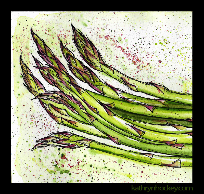
Click here to see my original Asparagus post.

strawberries, strawberry, fruit, fresa, fresas, conil, fruta, pen and watercolour, watercolour, water color, sketch, food, illustration, ilustracion, primavera, spring

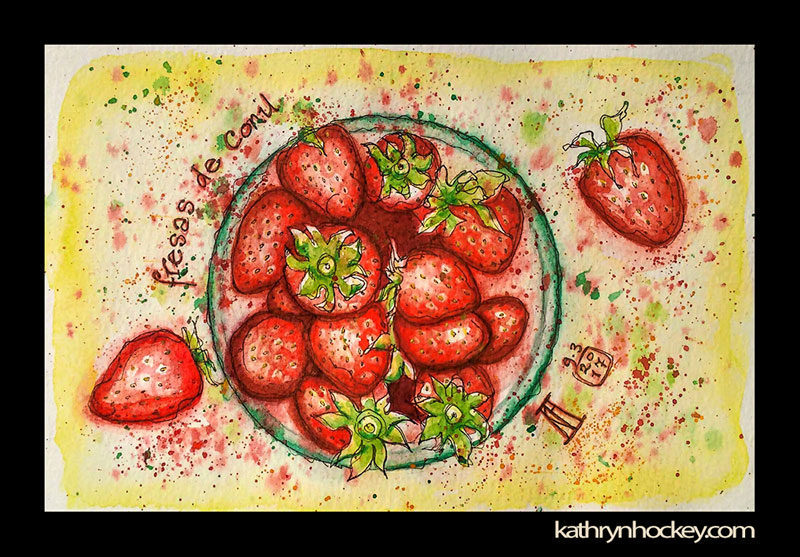
Strawberries from Conil taste and smell like those from my pick-your-own childhood. They’re so perfectly ripe that you must eat them on the same day you buy them; resistance is futile.

Here’s my original Strawberries post.

fruit, food, drawing, water colour, sketch, pen and watercolour, juicy, cherries, cherry

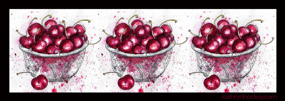
I was never aware before Vejer that cherries were graded so fastidiously in Spain. The size of the fruit and presence or absence of a stalk will dictate how much you pay per kilo of these juicy explosions. I never learnt to tell the varieties apart by taste though.

Here’s my original Cherries post.

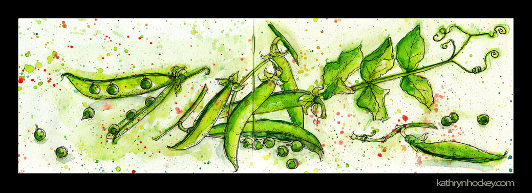
Tiny, sweet, tender and so, so pretty. I adore peas – and the additional meditative pleasure of popping the pods.

Here’s my original Peas post.

berenjena, aubergine, eggplant, vegetable, food, drawing, water colour, sketch, pen and watercolour, watercolor, illustration

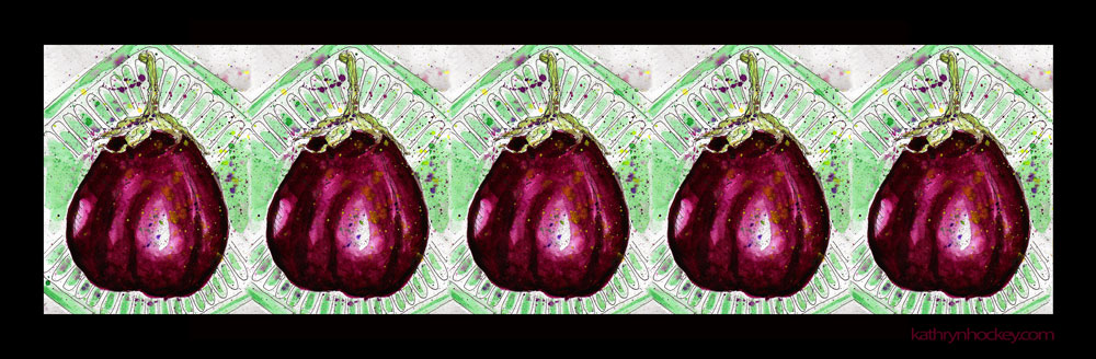
To be honest I’m rarely up for the faff involved in making aubergines edible but that jewel-like burgundy-mauve shade is beguiling.

Here’s my original Aubergine post.

pear, pera, pears, fruit, food, drawing, water colour, sketch, pen and watercolour, juicy

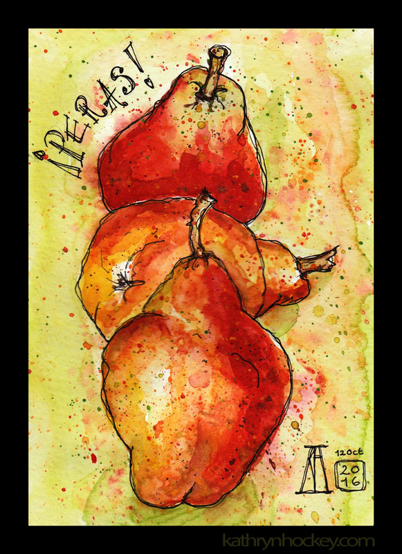
The pear – emblem of feminine strength and creativity, sweet of the autumn. That lichen-like mottling on a pear skin really is splendid.

Here’s my original Pears post.

lemon, ginger, cold cure, fruit, food, drawing, water colour, sketch, pen and watercolour, juicy

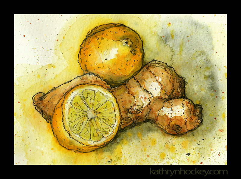
And so on to winter, here’s an actual cold cure that I used to treat an actual cold.

Here’s my original Lemon and Ginger post.

A massive and famous advantage of living in Spain is the culture of tapas. A bite or two of a tasty something – usually home-made, with a glass or two of a tasty something – usually alcoholic. 

tapas, ruta de tapas, tapas por vejer, vejer, vejer de la frontera, vejer sketchers, pen and wash, pen and watercolour, watercolor, sketch, illustration, food, 4 estaciones, restaurant, pueblos mas bonitos de espana, drawing, painting, sketchbook, beef tartar

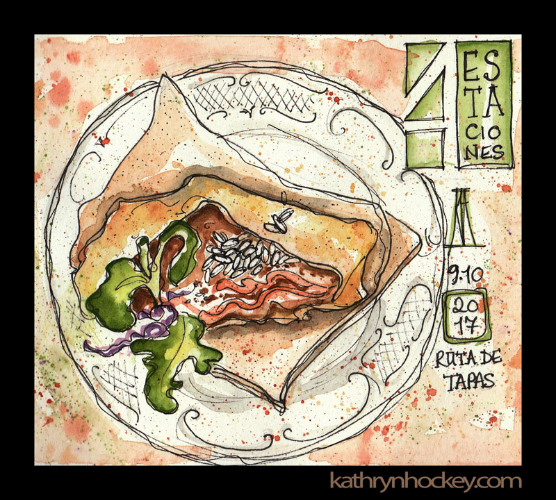
In Vejer (as in other places) there are a couple of special weekends a year when tapas competitions are staged. Maps of the Tapas Trail or ‘Ruta de Tapas’ show the locations of the establishments taking part and what they’re serving. Those restaurants work flat out to put their best tapas forward for the delectation of the hundreds of people who work their way around the trail before voting for their favourite dish. 

tapas, ruta de tapas, tapas por vejer, vejer, vejer de la frontera, vejer sketchers, pen and wash, pen and watercolour, watercolor, sketch, illustration, food, pueblos mas bonitos de espana, drawing, painting, sketchbook, pasta, ricotta, spinach, red onion sauce, la posta, italian restaurant

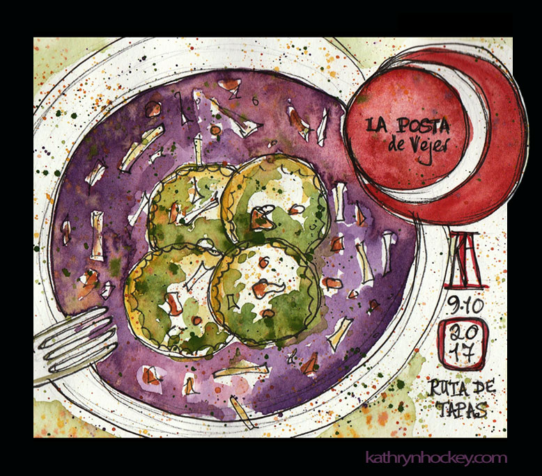
This particular weekend I decided to record as many Ruta de Tapas dishes as I could in a ‘paint it then eat it’ way. So I had to work fast and loose…

tapas, ruta de tapas, tapas por vejer, vejer, vejer de la frontera, vejer sketchers, pen and wash, pen and watercolour, watercolor, sketch, illustration, food, pueblos mas bonitos de espana, drawing, painting, sketchbook, gamba, langostino, mercado de abastos, market, street food, fish, roe, mercado de san francisco

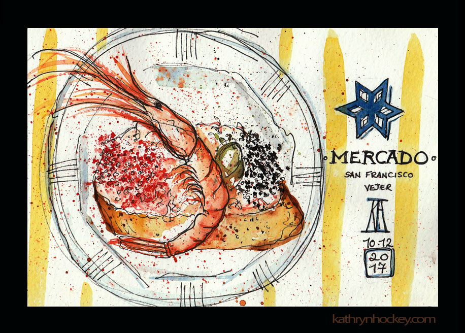
Three turned out to be my limit. My best advice for making the most of a Ruta de Tapas? Skip breakfast and start early to beat the crowds.

Here’s my original Tapas post.

corredera 55, restaurant, califa vejer, vejer de la frontera, andalusia, pen and watercolour, pen and wash, pen and watercolor, sketch, drawing, painting, facade, comer amar vivir, life without cake, vitamins abc

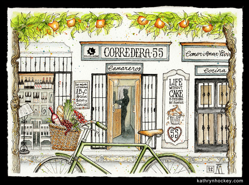
This painting of the facade of Vejer’s Corredera 55 Restaurant is a lovely one to end on. It features food in the bike basket, food in the orange trees, food on the facade and drink on the inside. Ellie the owner commissioned me to make this piece; the original is hanging in the restaurant alongside mini reproductions on the business cards. As it says on the flipside: Eat – Love – Live

business card, corredera 55, restaurant, califa vejer, vejer de la frontera, andalusia, pen and watercolour, pen and wash, pen and watercolor, sketch, drawing, painting, facade, comer amar vivir, life without cake, vitamins abc

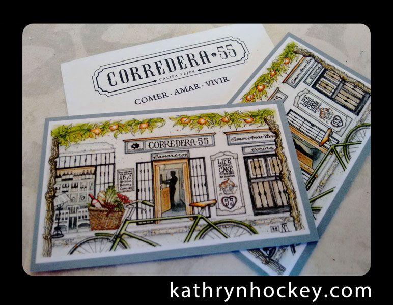
Here’s my original Corredera 55 post.

A note on method and materials:

My sketchbook is a Moleskine Watercolour Album, with 200g/sqm paper – that’s the minimum weight of paper that will take good watercolour washes without too much buckling. It’s 21x13cm; small enough to be portable but the double page length of 42cm allows for a nice big span. If I’m working on a pen and wash commission I’ll use 300g/sqm paper and cut it to size myself.

I always start with a 2B pencil drawing; when I’m happy with the layout I go over the outline with water resistant pens. Adding squiggly lines to the main outline makes it more lively.

I erase most of the the pencil before layering watercolour washes; when I’m happy with the intensity of the colours I’ll add shadows. The finishing touch is a bit of coloured splatter which unifies the image and adds a bit more energy.

By preference I’ll scan the finished painting at a fairly high resolution and slightly tweak the image in Photoshop with a soft light filter before posting a lower resolution version  to my ‘Latest Work’ blog.

For Instagram – @kathrynhockey – I just post photos of the work.

Scanning generally gives ‘truer’ colour reproduction and there’s less distortion of the image.

While I was traveling I didn’t have easy access to a scanner so the original ‘Latest Work’ posts of some sketches feature the same Instagrammed photos.

I recently scanned all of the food travel sketches to improve the quality of the images for this blog. I have added links to the original posts.

Afternoon Tea

afternoon tea, goring hotel, cream tea, cakes, scones, jam, clotted cream, sandwiches, tea, tea pot, watercolour, painting, sketchbook art, sketchbook, food illustration, pen and wash, watercolor, drawing, sketching, london, tea strainer

This afternoon tea was a birthday celebration for one of my favourite people.

A little group of us went to The Goring Hotel – the thirty or so tables in the bright dining room were all stacked high with delights.

The combination of the loaded cake stands, the striped crockery and the reflective tea pots in the late winter sunshine was quite spectacular. Smitten, I took some photos in preparation for future painting sessions.

Afternoon tea classically involves dinky crust-less sandwiches, scones with clotted cream and jam, and beautiful, tiny cakes all washed down with gallons of tea. This afternoon tea had an extra element – a cold soup of potato and goat’s cheese, garnished with a flower petal – served first, in a little glass.

I felt like I could represent each element of the afternoon tea at its most flattering angle if I composed the drawing from the perspective of looking down at your own place setting and then sweeping the gaze up to the top of the cake stand. 

Totally delicious!


7 Days

7 Days‘ is the title of the fifth and final assignment I completed for my illustration course with the OCA (Open College of the Arts)

The series of 7 patterns (1 for each day of the title) was inspired by a summer boating holiday on the Canal du Midi in the south of France, and also by the wonderful woodblock designs for wallpaper and fabric of Marthe Armitage, the dramatic wallpapers featured in Sherlock the TV series and the films August:Osage County and American Hustle.

The title page shows the location:

digital collage, map of France, canal du midi

I chose 7 themes from the trip and made a motif for each, which I then multiplied to make a pattern:

Day of the 2CV

2CV, digital collage, pattern, car, illustrationDay of the Locks

Canal du Midi, lock, canal boat, digital collage, pattern

Day of the Sunflower

Sunflowers, digital collage, pattern

Day of the Plane Tree

Plane tree, digital collage, illustration, pattern

Day of Patisserie

Patisserie, cake, digital collage, illustration

Day of the Dragonfly

dragonflies, dragonfly, digital collage, pattern, illustration

Day of the Grapevine

grapevine, vinyard, grapevines, digital collage, illustration

 My ultimate aim is to reproduce some if not all of these patterns on wallpaper, fabric and other surfaces.

The method was pretty much the same for each pattern; here’s an outline:

  1. Research photos and sketches made on the spot
  2. Preliminary sketches from the initial research images
  3. Pencil or pen drawing from the sketches
  4. Drawing scanned to Photoshop where the line work was cleaned (by adjusting brightness/contrast, duplicating with the layer blend mode set to multiply and using the eraser tool) and cut out
  5. Colours and textures added in Photoshop layers using scanned handmade collages and marbling, bought papers, flat and graduated digital Photoshop colours and textured colours in Corel Painter12
  6. Duplication of the coloured single unit
  7. Adding a background of flat digital colour or scanned paper
  8. Adding texture to the background

For those who are interested in seeing  the production method for each image in more detail I’ve added them below:

Title page

For the background I made a map of Europe by tracing the outline in pencil onto squared paper

traced-europe-map-kathryn-hockey-artist-illustrator

which I then scanned to Photoshop and inverted

I then collaged the map in Photoshop layers with some bought paper

and marbling I had made using oil paints

and a French flag which I found through an internet search

I distorted the map with the free transform tool and applied my inverted outline of a plane tree and grapevine pattern (methods below), adjusting the layer blending modes, tone, saturation, curves and levels in Photoshop.

I printed the text ‘7 Days a journey in patterns’ from Photoshop , traced it in pencil and scanned the tracing back into Photoshop where I coloured / inverted it


I wanted to show the location of the Canal du Midi, so next I made a collage of another map of France I found through an internet search, applying torn fragments from a French road atlas

working over it in water soluble green crayon and a wash of acrylic paint

before applying a crackle glaze and white acrylic paint to highlight the cracks and scanning it into Photoshop

I traced the outline of the canal in Corel Painter layers from this map I found on the internet and applied it to my cropped collaged map in Photoshop, adjusting the tone and saturation, adding text to mark Toulouse and Sete (the towns at either end of the canal), and creating a border using the brush tool and a scan of aged paper in layers.

I had a practice run at labeling France on a print out my map of Europe (to which I’d applied a crackle glaze and white acrylic paint) with collage and biro

I cut out the collaged label of the lower left version in Photoshop and applied it over my background, including a smaller duplication of the ‘flagged’ France and a smaller duplication with reduced opacity of the Canal du Midi map over the larger ‘flagged’ France map

Finally, in Photoshop, I adjusted the tone and saturation of the background to improve the contrast, added and coloured a boat from the locks pattern (see below) labelled the Canal du Midi on the larger map insert and added an inverted outline of the 2CV drawing (see below).

Patterns:

2CV

Research photo taken in France, I also referred to a photo I found on the internet

Pen drawing

Scanned to Photoshop, line work cleaned and cut out

Coloured in Photoshop

2CV, car, digital collage, illustration

Curves adjusted, image duplicated and scanned paper added in Photoshop layers for background texture

2CV, pattern, car, digital collage, illustration 2CV, car, pattern, digital collage, illustration

Tone adjusted to achieve different coloured versions

Locks

3 sketches made on site to show how the canal boats go ‘up and down hill’ via the lock system

1 of many, many photos I took of the boat in a lock

A series of sketches I made to work out how to show how boats move up and down stream through the lock mechanism in ‘3D’

I traced the final sketch, made a pen drawing and scanned it to Photoshop in 2 parts

The line work is cleaned, duplicated, aligned and cut out in Photoshop

Outline duplicated in Photoshop layers on a scanned paper background with stripes added with the brush tool

Canal locks, digital collage, illustration

Collage and colour applied to the line work in Photoshop layers: leaves with the collaged map of France (see above); water with the brush tool; locks with the photo of concrete shown below

Locks, canal, canal du midi, lock diagram, digital collage, illustration

Finally the single unit is duplicated and stripes of scanned blue paper are added in Photoshop layers. I also added a final outline layer over the top to improve definition. The repeated unit is reminiscent of the form of Tibetan thangka art

Sunflowers

Research photos taken on the spot

Rough sketches for possible pattern layouts, I wanted to show the sunflowers rotating, as if towards the sun

Pencil drawings

Sunflower1-kathryn-hockey-artist-illustrator-web

Drawings scanned to Photoshop, line work cleaned, trimmed and cut out

Sunflower-3-kathryn-hockey-artist-illustrator--web

Pattern trials made by duplicating layers in Photoshop

Sunflowers coloured in Photoshop layers: yellow centres and green parts collaged with different tonal versions of the France collage map (see above); petals with flat and graduated digital colour

Collaged sunflowers duplicated to form single unit of repeat

Single unit duplicated and flipped vertically

Sunflower-blue-kathryn-hockey-artist-illustrator-web

Colour and pattern trials

Sunflower-blue-collage1-kathryn-hockey-artist-illustrator-web

I finally settled on a blue background, to represent the summer sky, adding texture to it via a scanned canvas

Plane Tree

Planted between 1681-1810, plane trees line long lengths of the Canal du Midi and are dying because of a fungus but I decided not to portray the dying trees in favour of ‘aesthetic delectation’.

Sketch made on site

plane-tree-photo-kathryn-hockey-artist-illustrator-web

1 of many research photos taken on site, I also referred to this Natural History Museum photo

Plane-tree-pattern-sketch2kathryn-hockey-artist-illustrator-web

Rough sketches to work out a single repeating unit

Pen drawing of the single unit

Single unit duplicated in Photoshop layers

Pattern line work inverted

Yellow tonal version of my collaged map of France added as a background to the inverted cut out line work. It overpowered the pattern which lacks definition

I redrew the single unit in pencil, adding more detail

Drawing scanned to Photoshop, line work cleaned and cut out

Plane-Tree-collage-kathryn-hockey-artist-illustrator-web

Collaged in Photoshop layers with my France collage map

Line work inverted and tone of collage adjusted, I love these autumnal shades but my pattern needed to be summery green

Layer effects applied to inverted line work

The version I decided to repeat

Pattern variations

Patisserie

Research photos

Pen drawings made from photos

Drawings scanned to Photoshop, line work cut out, inverted, duplicated and coloured in Photoshop and Corel Painter12

Coloured cakes duplicated to make a pattern

cakes, patisserie, digital collage, illustration

 Inverted line work introduced to background to add depth, subtle granular texture added

cakes, patisserie, digital collage, illustration

Closer crop

Dragonfly

Research photo

Partial pen drawing

Drawing scanned to Photoshop, cleaned, part duplicated and flipped horizontally

Playing with tone and saturation settings

Line work inverted

Playing with tone and saturation settings for the inverted version

Inverted line work multiplied

Line work on a scanned paper background

Multiplied

A4 crop

Grapevine

Research photos

Preliminary sketches from photos

Pen drawing

Scanned and duplicated

The single unit was collaged in Photoshop layers with the following material:

marbling I made with oil paints

scanned to Photoshop and tone/saturation adjusted for the grapes

my collaged France map for the vine leaves

textured paper for the ground

textured paper for the vine trunks

The duplicated collage

A closer crop